5 Scary Things That Keep An Artist Up At Night

October 29th, 2020

It’s almost Halloween, that time of year when we like to tell each other scary stories. Here are 5 scary things that frighten an artist. Well, they scare me, at least.

I’m not real big on horror movies. I watched way too many as a teenager, and they got too predictable. (I thought Scream was stupid. There, I said it.)

"Pilot of the Storm Who Leaves No Trace," acrylic on canvas.

Detail from “Pilot of the Storm Who Leaves No Trace.” Acrylic on canvas.

The downside to having a creative imagination is that you imagine the worst thing that could happen. (In this time of COVID, I cough, and suddenly I see the entire process of getting sick and dying and all the things I’ve never done that I’ve wanted to do. I can go from fine to morose and back in about 23 seconds.)

While I’m cautiously optimistic about things like my health, there are things that scare an artist like me:

  1. Failure: what if I mess up and fail?
  2. Success: what if I’m so good that I succeed?
  3. What if nobody likes my art?
  4. What if everyone finds out I’m really not that creative?
  5. How do I price my work?

Sure, other artists might worry about running out of ideas or art supplies, but these are the things that I worry about. Maybe I operate on a sense of protecting my ego or something. I don’t really lie in bed worrying about things since I stay up late working on projects, or more likely, watching Netflix. I do worry about stuff with a vague sense of dread that gnaws at me. When I’m pressed, these are the things that I’ll name that bother me.

Let’s dig into what scares artists

Above, I gave you a list of the things that scare artists. Well, the things that scare me. Let’s dig in.

1. Fear of failure

Being a creative failure definitely scares artists. I think most people would argue that failure is one of the worst things that can happen. And in some ways, that’s true. Nobody wants to find themselves in financial ruin or responsible for getting other people in some sort of trouble. And I’d guess that most people don’t want to look like idiots, either. So rather than not risk messing up in front of people, it’s easier to stay home and watch Netflix.

But sometimes failure is a great teacher.

2. Fear of success

Personally, I think success is scarier than failure. With failure, I can hide it to some degree. Success stands out. I think I am afraid of achieving something and not being able to keep it up.

Or I’m afraid of getting so good at something it makes a lot of money, and I’ll get bored with it and it’ll be the only thing that makes me any money and I hate doing it.

3. Fear of rejection

This one is simple enough. What if people don’t like my art? Or if my art is no good? That I’ve been working hard for nothing? This ties in closely to the fear of failure.

"Pilot of the Storm Who Leaves No Trace." Acrylic on canvas. Painted while blasting Led Zeppelin's song "Kashmir" on repeat.

“Pilot of the Storm Who Leaves No Trace.” Acrylic on canvas. Painted while blasting Led Zeppelin’s song “Kashmir” on repeat.

4. Fear of being found out

This is classic Impostor Syndrome — the feeling that you’re not good enough to do what you’re doing, that you’re just faking it and nobody knows it except you. Who are you to do this thing? Who am I to call myself an artist? Thing is, I’ve known I’m an artist since I was a kid. If 8-year-old Brad knew he was an artist, then 40-year-old Brad can be an artist. And creativity doesn’t just happen. The idea that it’s all based on talent is a limited view, a fixed mindset. If Leonardo da Vinci said he is always learning, then so can I.

5. Fear of pricing my art wrong

Pricing is one of the hardest things for an artist to do, in my experience. I’ve had to learn to not sell myself short. It’s hard to put a monetary value on something that gives you such joy and is so therapeutic. But I’ve learned to charge what I’m worth. I don’t want to overcharge, and I don’t want to under-charge, either. If I overcharge, I’ll lose my customer. If I under-charge, I cheat myself.

What to do about what scares me?

Of course, I think the best thing to do is take action. Action kills fear every time. It’s the unknown that scares us the most. When something is vague and undefined, it’s scary because it could be anything! Once you do something, it’s less scary the second time because you know what to expect.

What about you? What scares you the most?

How painting from my imagination is more real

October 24th, 2020

Sometimes I feel that painting from my imagination is more real than painting from reality.

In the past few years, I have increasingly painted from my imagination more than photographs or life. Painting from my imagination is more real to me because it reflects something deep in my soul — and yours. Here’s why.

Painting from photographs — or better, from life — is good practice for an artist who is learning their craft. It teaches proportion, depth, line, color, value, all that good stuff. Any artist worth their salt needs to know these things to produce good art. And they need to know these rules in order to break them, also to produce good art.

The value in painting from life is that it teaches the artist how to see.

Urban landscape of Boot Country, a tourist attraction in downtown Nashville, painted in the early 2000s by Brad Blackman

“Boot Country,” 2007. Oil on canvas, 24 x 36 inches.

The artist begins to see color and light and proportion and form like never before. She discovers colors that weren’t there a moment ago because two colors have been put side by side. There are new ways of presenting forms. And new surfaces to touch. New harmonies and discords that evoke a mood.

Once an artist gets to a certain skill level, it’s not enough to present what simply is, but what it means. What’s beneath the surface? What do these colors mean? Why is this figure here and not there?

This is how traditional art techniques have conveyed meaning for centuries. Some artists still work in traditional, “realistic” methods and convey a great deal of meaning. A good artist can arrange a still life, or compose a scene with a sitter and certain objects, or imagine certain objects that aren’t actually in the room, in order to express something they feel is important.

The artist has employed their imagination to make their vision appear on the canvas.

The internal world and the external world are linked: how science says imagination may be more real than you think.

The internal world can have as much an impact on a person as the external. After all, internal things such as our emotions and moods can have a strong effect on our physical well-being.

I took a psychology class in my Freshman year of college. There was a case we studied where research compared the brain patterns of depressed people versus healthy people. While wired up to the equipment that measured brain activity, an otherwise healthy woman was talking about her recent breakup, and she momentarily showed the same patterns as a depressed person.

This may be anecdotal evidence at best, but for me, it confirms that “internal” emotions can have a definite physical effect. Internal pain is just as real as physical pain.

I think at some point, what the artist sees or imagines internally is more real than the external world.

The imagined can be brought forth into reality, because for the artist it was real all along.

For a while, I took photos with my smartphone, edited them digitally, and then painted them. This approach creates some wonderful results. But after a while, I felt like I was simply copying my photographs and painting them. So I have tended toward creating new, imaginary scenes lately. Sometimes what I want to express just isn’t in a photograph that I’ve taken. I might combine several photographs, or let the canvas intuitively guide me to something.

What’s my soul guiding me toward? Is it real? Is it abstract? I can’t always say. For me, it is real the minute I put it onto the canvas. What I do know is that’s what I’m supposed to be doing at that moment. I feel like it’s my job to just watch and listen. I’m just a vessel.

Imaginary landscape, work in progress by Brad Blackman - where imagination is more real than any real thing.

Imaginary landscape, a work in progress – where imagination is more real than any real thing.

What does the artist see when he or she closes their eyes?

By doing this, the artist sees, and asks what is possible: what could happen? What wants to happen?

It’s important to realize that prospettiva isn’t just perspective, but pro-spective, a seeing forth. Your vision is very much informed by who you are, so you see through your own lens of experience and attitude and mindset. True vision is seeing forward. And often that seeing forward happens by first looking inward. Look inward, see what is there. Then look outward, and make that a reality.

What I see inwardly is all the possibility of what can be.

My obsession: finding magic in liminal spaces

October 15th, 2020

For years I felt stuck in a certain situation I couldn’t see past.

I was between two phases in my life, on the threshold between two things. We call these liminal spaces. I’ve since come to learn that there is magic in the discomfort. Instead of fighting it, I chase it.

Morning Fog, oil on canvas board, 14 x 11 inches.

“Morning Fog.” Oil on canvas board, 14 x 11 inches.

The word “liminal” comes from the Latin limen, which means a threshold, such as a doorway or portal, anywhere you enter or exit or begin or end. So a liminal space is that time between “what was” and “what’s next.” It’s a period of transition and transformation.

It’s often uncomfortable.

Richard Rohr describes it like this:

… It is when you have left the tried and true, but have not yet been able to replace it with anything else.  It is when you are between your old comfort zone and any possible new answer. If you are not trained in how to hold anxiety, how to live with ambiguity, how to entrust and wait, you will run…anything to flee this terrible cloud of unknowing. 

and:

where we are betwixt and between the familiar and the completely unknown. There alone is our old world left behind, while we are not yet sure of the new existence. That’s a good space where genuine newness can begin. Get there often and stay as long as you can by whatever means possible…This is the sacred space where the old world is able to fall apart, and a bigger world is revealed. If we don’t encounter liminal space in our lives, we start idealizing normalcy.

There are all kinds of reasons for finding yourself in that transitional space: job or career change, moving to a new place, financial stress, quarter-life crisis, midlife crisis, divorce, changes in health, becoming a parent, and so on. It’s a time of transition and transformation that has an enormous impact on you in such a way that you have a lot of uncertainty about the future.

We all experience these things, and they impact us in different ways.

My roller coaster ride with liminal spaces

2020 has been a strange year for a lot of us, but for me it has simply been a time when everyone was experiencing the same strange sensation of “no place.” There’s nowhere to go, and you lose track of where you’ve been.

Yet a few years ago, I was in the middle of some turbulent times. In the space of five years, I:

  • got married
  • became a parent
  • lost my job
  • moved several times
  • started a new job
  • had another kid
  • changed jobs a couple more times
  • lost a grandparent
  • had another kid

It was a lot to take in, and I had a sort of “I’m in my thirties” crisis.

Meanwhile, my painting subject matter reflected this transition in my life.

Over that five-year period, I shifted from urban architecture to foggy abstracts. Urban structures are rigid and clearly mark a place. I painted buildings and markers for buildings and highways and architectural details. In time, I painted a few parking garages and abandoned buildings. Parking lots are by definition liminal, since they are a space you occupy briefly on your way to another space.

Then my work evolved into to hazy, foggy abstracts that could be anywhere. I had fully moved from the concrete to the ephemeral, although my instinct for the manmade structures was one of a slow ephemerality as buildings slowly decay and give way to nature.

“Boot Country.” Oil on canvas, 24 x 36 inches.

West Park, worms-eye view of building

“West Park,” oil on canvas, from the Nashville 365 Series.

"Morning Mist." Acrylic on canvas, 20 x 24 inches

“Morning Mist.” Acrylic on canvas, 20 x 24 inches

Abstract sunrise painting with blue and red sky

“Morning Drive.” Acrylic on canvas, 8 x 8 inches.

My tendency to paint sunrises and shorelines emphasizes the liminal, as the sunrise or sunset marks the transition between light and darkness, and the edge between water and land is itself another kind of transition.

I’ve come to embrace those transitional, liminal spaces as sacred.

Now, when I find myself in those transitional periods, I embrace them. There’s something sublime about them. I get the sense that something important is about to happen. I want to relish the opportunity. It’s easy to get paralyzed or push as hard as you can. I don’t want to run away to avoid the discomfort. I believe those experiences have much to teach me.

Are you embracing liminal spaces, too?

Nearly all the artwork I’ve made in the past five years touches on some aspect of liminality, and it has only increased now that I recognize it. You can shop for it here.

How I use the Golden Section When I Paint

July 23rd, 2020

Ah, the Golden Section (or Golden Mean), that mysterious mathematical concept found in nature, art, architecture, and music. A little-understood principle of design that people like to talk about to sound smart, myself included.

Once you become aware of it and understand it, you start to see it everywhere. I’ll tell you a little about what it is (without going into too much detail because there are entire websites dedicated to the topic) and how it is used in art and how I use it myself.

What is the Golden Section?

First of all, the Golden Section is a Mathematical concept that is seen in nature and used in art, architecture, and music. It’s based on something called the Fibonacci sequence, which is a sequence where each number is the sum of the two numbers preceding it. It goes like this:

0, 1, 1, 2, 3, 5, 8, 13, 21, 34, 55, 89, 144…

If you get far enough along in the sequence, the ratio between the numbers is very close to 1:1.61803. What that means in art is you can use it to draw a rectangle or use a canvas where the sides have a ratio of 1:1.61803. So it is close to a two-thirds ratio or more accurately, a 5-to-8 ratio. It’s considered one of the most harmonious and pleasing ratios in the universe. There are several ways you usually see this expressed:

Golden Rectangle

Simply create a square, divide it in half, and draw a diagonal line from the bottom left to the top corner of the half. From the center, extend that same length of line and the end of that is the end of the rectangle. Square it off from there and you have a Golden Rectangle where the short side is 1 and the long side is 1.618. Or the long side is 1 and the short side is .618 of the long side.

How to make a Golden Rectangle - from Empty Easel

If you take a Golden Rectangle and cut out a square, the remaining section is also a Golden Rectangle. You can keep doing this to infinity.

Dividing Rectangles

With any canvas, you can find the Golden Mean point between the edges by multiplying the length by .61803. It’s close to a third — more on that in a bit. You can place these lines on the canvas coming from all directions, then where the lines converge, place important elements there. It gives it a harmonious structure.

Golden Spiral

This is perhaps the most well-known depiction of the Golden Mean. If you connect the points of a bisected Golden Rectangle and make a curve from it, you get the Golden Spiral. You see it everywhere in nature. Make a fist, and look at the spiral of your pinky finger to your hand. That’s pretty close to the same spiral. The shell of the Chambered Nautilus looks like this when you cut it open. Each chamber is 1.6108 times the size of the previous chamber.

Animated Golden Section Spiral

By Jahobr – Own work, CC0, Link

Golden Triangles

Golden Triangles are a bit more complex. You can find them in the Golden Spiral, and by joining the “big” and “little” triangles, you get another Golden Triangle, similar to how the Golden Rectangle repeats itself. A regular pentagram contains Golden Triangles.

The “other” Golden Section: The Rule of Thirds

The Rule of Thirds is a simpler, yet related concept. Since 1: 1.6180 is so close to the 1:1.5 ratio, which is the same as 2:3, you can fudge a little and work with thirds instead. Divide your canvas into thirds vertically and horizontally, and place your focal point on one of the four intersections. Chances are you won’t be right on the nose on that point but in the vicinity of that point as well as the Golden Mean point, which is often close enough.

The rule of thirds: divide the canvas into thirds, and place the most important element at one of the intersections.

The rule of thirds: divide the canvas into thirds, and place the most important element at one of the intersections.

Some famous examples of the Golden Section from Art History

The Parthenon: Many have said that the Parthenon was built on a 1:1.618 ratio, but it’s actually more like 4:9. The effect is similar, though.

Leonardo Da Vinci famously used the Golden Section (or Golden Mean) in his artwork. I think people look too hard for it in his work, which is highly detailed with lots of elements which can be construed as lining up a certain way. Was it intentional or coincidental? Who knows? That’s probably how Da Vinci wanted it.

Salvador Dali intentionally used the Golden Ratio in his artwork, as you can see in this preliminary sketch for “Leda Atomica.” He was influenced by the book The Geometry of Art and Life (1946) by Matila Ghyka. He cast his wife Gala as Leda, in love with Zeus as the swan, and set her inside a pentagram inside a circle, aligning elements of the painting with the lines of the “divine” shapes.

Salvador Dali's sketch for Leda Atomica, 1949 uses the Golden Section in the form of a pentagram and triangles.
Salvador Dali, Leda Atomica, 1949. Oil on Canvas, 61.1 cm × 45.3 cm (24.1 in × 17.8 in). Dalí Theatre and Museum, Figueres.

Salvador Dali, “Leda Atomica,” 1949. Oil on Canvas, 61.1 cm × 45.3 cm (24.1 in × 17.8 in). Dalí Theatre and Museum, Figueres.

Demonstration of how I use it

When I use the Golden Mean when I paint I usually just find the lines from the edges and place important elements there. It’s most often where I put the horizon line.

Brad Blackman, "Hope," 2018. acrylic and gold leaf on canvas. 30 x 24 inches

“Hope,” 2018. acrylic and gold leaf on canvas. 30 x 24 inches

Golden section lines overlaid on

Golden section lines overlaid on “Hope” painting.

In my painting “Hope,” you can see where most of the gold “cloud” fits between the lines, and the peak is at one of the intersections.

If I’m not using a square canvas, I use a 2:3 proportion, or something close to it. A 5:8 canvas proportion is more exact. I’m not a slave to using this proportion, since I actually prefer painting on squares. I use the Golden Mean as a general guideline.

When I’m doing page layout as a graphic designer, I like to start with a 6×9 page, and divide that into a 9 x 9 grid, which is easy to build on. I totally stole this idea from Jan Tschichold, who created the classic Penguin book covers.

Animation of applying the Golden Section on a page grid by using a series of 2:3 rectangles and grid lines.

I like this 2:3 method which works well for creating a nice page grid. Most of the time I don’t get to use that page proportion, but I often create a 9×9 grid on the page and use that as a general guide.

The Golden Section is not a hard and fast rule

I don’t think you have to use the Golden Mean (Golden Ratio or Golden Section) in artwork for it to be good. This is just one tool among many, and I don’t always use it. Some people draw lines all over stuff and then say it means something profound when it doesn’t mean anything at all. I just use it as a rule of thumb and then break the rules as I see fit.

Dangerous Inspiration: The Risky Thing I Do

July 2nd, 2020

I used to take pictures while driving. That dangerous photographic inspiration made its way into my paintings. But not anymore – it’s too dangerous and risky.

Before the hands-free Tennessee law was passed, I would take pictures of things as I passed them on the road. Yes, I knew it was dangerous. I’ve since quit doing it. I’m not sure if that’s because I don’t drive as much now due to the state of lockdown over the past two-and-a-half months or if it’s out of respect to the law — probably a combination of both. Also, my compositions are becoming less photography-based. But for years I would photograph things while driving and use those photos as reference for my paintings.

I was obsessed with overpasses, then fog

It all started not long after I got out of college and while driving to and from work, overpasses would catch my eye. I was fascinated with these triangles of light and shadow that emerged from the angled embankments beneath the overpasses and bridges. It was dangerous inspiration because I’d try to snap photos while the car was moving. At the time my paintings were fairly realistic but with exaggerated colors.

I scanned the prints and manipulated them in Photoshop. Then I painted the manipulations on canvas.

Brad Blackman "McGavock" 2003. Oil on canvas, 40 x 20 inches

McGavock, 2003. Oil on canvas, 40×20×2 inches 

Every now and then I would experiment with abstraction, flattening and simplifying everything, perhaps a sign of things to come. I wanted to focus on the dynamic shapes while keeping a sense of depth and drama.

Brad Blackman, Melrose II, 2004. Oil on canvas.

Melrose II, 2004. Oil on canvas, 30×30 inches

How dangerous is it to carry a camera in the car?

I had an SLR camera that a family friend from church purchased for me before I went off to spend a semester in Italy a few years before. This was before digital was really a worthwhile investment, and I would keep it handy.

After several years of hard use, the Canon Rebel was broken beyond repair — I could have gotten it repaired but it would have cost as much as getting a new one. So I saved up my money and got the first generation digital Rebel. I carried that DSLR in the car a lot, too. I remember going on excursions where I would walk for miles on a bright Saturday morning, capturing architectural details and then painting them later. Not quite the dangerous inspiration as shooting photos while driving. I got much safer.

Morning Fog, 2013. Oil on canvas board, 14×11 inches

Morning Fog, 2013. Oil on canvas board, 14×11 inches

I used to dream about “prosumer” level cameras with 17-megapixel capability so I could print out images in perfect clarity on a tabloid size sheet of paper.

As I moved into the abstract, photo quality ceased to be as important. I experienced a resurgence in photography about 9 years ago when I got my first iPhone, experimenting with abstract realist photos of the architectural details I saw in my lunchtime walks in downtown Nashville.

Not long after that, my paintings became more about capturing mood and atmosphere, not photographic details. Eventually, I quit printing my photos out, opting instead for viewing them on my iPad while painting, and even then I didn’t use them as reference very long as the canvas would take on a life of its own.

I don’t do this anymore, and I don’t recommend it

As I mentioned earlier, Tennessee passed the Hands-free Tennessee law last summer, which makes it illegal to use your device while driving. I’m happy to say I’m about 95% hands-free now (still need to get a mount to put my phone on the dashboard) and I don’t take photos of things while driving anymore.

I’m still inspired by the same things, such as fog in a field and light and shadow on overpasses. But now if I capture photos of it I do it when I’m a passenger or record it in my mind.

Finding Hope in a Frightening Pandemic by Making Art

April 27th, 2020

This pandemic is an odd combination of boredom and terror. It’s frightening, and we are all looking to find some hope in the middle of all this bad news. Thankfully I’m finding hope by making art.

If you’re lucky enough to still have a job, you’re frantically working on your laptop all day during the workweek, keeping one eye on the news. Weekends are depressing because you can’t go anywhere. You’re confined to your house. No going to the movies, no meeting friends for dinner or drinks. You don’t have the energy to read a book, and you’ve watched everything on Netflix. You finally found the mythical end of Instagram, and you just spent five hours watching crazy TikTok dances.

So you scroll Facebook, bored.

Pink and orange abstract painting created during COVID-19 lockdown

In that boredom amidst the memes and political arguments is an artist trying to calm himself down by putting paint on canvas.

I am that artist. Like you, I’m bored and scared, too.

That’s why I’m trying to brighten things up by inviting you into the studio for a while. Not to forget our cares, but to honor them, and to come to a sense of peace about what’s going on in the world.

When the COVID-19 pandemic hit, I was sad, anxious, and scared.

Like a lot of people, I initially made a mental list of projects to work on, books to read, and so forth. My wife and I figured if we were going to be at home for two weeks (ha – it’ll be 6 weeks tomorrow!) we might as well tackle some of those projects we’ve been putting off for ages (nope, still haven’t done them), so we went to the hardware store to stock up on supplies.

The week before the lockdown was Spring Break, and since we didn’t have vacation plans, we had already stocked up on books for the kids to read. And the week before that, Nashville was hit by a severe tornado.

So everything was upside-down.

But after a few days of trying to adjust to the “new normal” of all five of us being at home 24/7, we got into a rhythm. We had our workspaces set up. We ordered new Kindles for the kids. We exercised every morning. We tried to deal with the weirdness of the whole experience by quickly setting some normal patterns.

Then my part-time graphic design job had to let me go since the economy tanked in a matter of weeks.

I was not prepared for the trauma that would come with all this.

I allowed myself to grieve.

But I numbed myself a bit by staying up too late watching Netflix and then sleeping in. My sleep cycle got messed up. (It is still messed up.)

I found my anxiety growing. When I get anxious, I work myself in to a frenzy and do lots of things without getting anything finished. Lots of puttering around and wondering what I actually did that day. I found myself getting depressed.

Finally, I got in the studio. I had been making a little bit of an effort to paint more, but I’ve now fallen into a rhythm of getting in the studio at least once a week. Saturday night seems to be when most people are online. They are bored, sad, and anxious.

Making art regularly helps me slow down and breathe.

When I paint, I tend to be frenetic, but I get the best results when I slow down. There’s a certain effect I like to achieve when I use the palette knife (or painting knife – I use the terms interchangeably) but it doesn’t work unless I slow down.

So when I drag paint onto the canvas with the knife, I stop and take a deep breath. As I exhale, I slowly drag the knife across the canvas. The paint rewards me by going on exactly how I want it to.

My audience calms down, too.

I suppose my mood is contagious. It makes sense: if I appear on screen all jacked up, it will spread to my audience and I’ll stress them out. If I’m calm, and bring a message of hope, whether through my words or my painting, it’ll calm down my audience, too.

I’m not Bob Ross, but as I paint live, I find myself coming around to some of the same hopeful themes he expressed on his show.

Nine times out of ten, the things I say are the things I need to hear, myself:

  • “You can’t appreciate the bright spots without the dark spots. The dark areas make the bright areas stand out more. Paint the bright areas on top of the dark areas and it’s more dramatic, more rewarding.”
  • “Slow down and breathe. Slow is smooth, and smooth is fast.”
  • “Colors don’t exist in isolation. Every color is affected by the colors around it. Everything is affected by everything else.”
  • “I have to work all the way around the canvas, instead of only on one thing. I can’t get too focused on one spot and overdevelop it.”

In the process, I find hope.

Sometimes that hope gets buried. But it’s been in me all along. Often, I can’t see it, but it’s there. I just have to look for it. Sometimes I’ll go after it directly, or I take a lateral drift approach to find it. Hope always shows up. It’s there. Hope may be loud, or it may be quiet. But when I find it, it’s my job to share it. A sacred duty, as it were.

What Makes Painting Abstracts So Thrilling?

January 14th, 2020

I love looking at abstract painting and I love painting abstracts. It’s so thrilling to experience the raw energy the artist put onto the canvas. It’s even more fun to create abstract paintings.

A big part of what makes painting abstracts so thrilling for me is that it helps me understand and tap into the language beneath the language we all know. It’s a complex, wordless language that goes deep into our collective subconscious. Yes, it’s kind of mystical and Jungian. And I’m fine with that.

It’s challenging for me because I have to break past the layer of the more or less “literal” way of thinking that I grew up with.

In that sense, abstraction is a “pure” form of art unencumbered by the language of realism.

100 Days of Abstracts, Day 30

100 Days of Abstracts, Day 30, acrylic on canvas

The language of realism tells you “this is a tree” or “this is a person.” Abstraction allows you to hint at those things, or do away with them entirely, favoring composition over referencing real things. (This is called nonobjective abstraction. DeStijl pioneer Piet Mondrian was a master of this sort of abstraction.)

In the past few years I have grown more obsessed with the color field paintings of Mark Rothko. I have yet to see one of his works in person, but I hear they are deeply moving. There’s something about a large canvas flooded with subtle variations of a single color that stir something deep in your soul.

Since so many of us in the West grow up looking at art from an objective point of view, it is sometimes difficult to understand abstract painting since it doesn’t fit your frame of reference. To that, I say to think of it like music. Look for texture, rhythm, loud and quiet. Music rarely references things in the real world. Painting doesn’t have to, either.

By painting in an abstract manner I am able to explore my emotions and find answers to those wordless questions deep in my soul. The more primal a piece of art is, whether it’s music or painting, the more it resonates with our core.

Realism tends to be obvious in its interpretation

"Hoth" painting surrounded by jingle bells and twinkle lights

Hoth, acrylic on canvas

Sometimes a realistic painting is just a painting of whatever you see, nothing more. Other times, the artist adds symbols with personal meaning, or the subject matter is intended to inspire the viewer to consider a certain worldview. (Brian Rutenberg would argue that all paintings force the viewer to look at the world differently, if only for a second.)

Of course, some surrealists have fun with objective visual language, especially when their paintings are realistically rendered but full of double meanings and visual tricks on our our perception of space. Painters like Salvador Dali, Rene Magritte, and Donny Smutz come to mind.

Abstract painting invites the viewer to participate and interpret

Brad Blackman's custom painting "Silver Lining," shown in a living room.

Silver Lining, acrylic on canvas, 20 x 20 x 1.5 inches

I love hearing all the things people say they see in my abstract paintings. Most of the time I have a landscape in mind. Personally, I often see clouds and a horizon, littered with landforms and foliage.

But lots of people tell me they see something else, and it’s amazing. It’s a lot like looking at clouds with a friend: sometimes you see something whimsical, and sometimes you see something profound that changes your life. And your friend sees something else entirely.

All paintings are abstract in some way.

Bob Burridge says that under every great painting is a great abstract painting. The rules of composition apply to abstract painting as representational painting, perhaps more so since that provides a frame of reference.

Sometimes abstraction looks like an unfinished painting that invites the viewer to invent their own story. And that’s what I find thrilling.

Why I Quit the 100 Day Project

October 30th, 2019

The short version of why I quit the 100 Day Project: I got tired of working small and I ran out of time. The long version: I got halfway through but was overwhelmed and would rather move around and paint big paintings.

This time last year, I announced that I was painting 40 paintings in 40 days.

An assortment of Brad Blackman’s 40 Days of Abstracts series, standing on a white background in the studio

It was a fun project to paint 40 paintings in the 40 days leading up to my 40th birthday. And I completed all 40 paintings on time! I learned a lot about myself, showing up every day. It was a successful project. But I was exhausted! Something I quickly forgot about, five months later.

So in April 2019, I decided to participate in the 100 Day Project

The 100 Day Project is simple, just like Art Every Day Month or Inktober: you make art every day for a certain period of time. These challenges are great for getting out of a creative rut, or for making yourself do something consistent.

I discovered a few years ago that one of the best ways to do a daily artwork challenge is to have a specific theme and a small size.

I think that’s why Inktober has enjoyed such popularity and success. You end up with 31 pieces of the same medium and probably the same size. Since there is a list of prompts, you don’t have to come up with the idea for each one. The social media hashtag allows you to see how others respond to the prompts, which is fun.

But with trying to ramp up a freelance graphic design business, I ran out of energy and time to dedicate to the 100 Day Project. I got behind and resorted to my trick of attaching several canvases together to create a larger scene, thus knocking out several small paintings at once.

Days 34-42 of the 2019 100 Day Project

Days 34-42 of the 2019 100 Day Project

That was when I realized I missed painting on big canvases. Switching from a four-inch square to a twelve-inch square was exciting. I remembered how this used to be tiny. Once upon a time, I didn’t paint much of anything smaller than twice this size!

I like to paint big

I want to move when I paint.

I want to feel something when I paint.

I want to paint on giant canvases like Robert Motherwell.

Move the paint around with a broom or something.

I want to surprise people when they walk into a room with one of my paintings, and they see this huge canvas that touches their core.

The sheer number was overwhelming

Since my style is abstract, the best abstract paintings come from the heart with a very loose plan, so it’s hard to go with prompts. Abstracts are best when improvised and then adjusted to fit concepts of design and color theory. And trying to plan a hundred paintings when your best way of painting involves minimal planning is hard.

The next time I do a challenge, I’m likely to do something else

Next time, I’ll probably just make a point to simply show up in the studio each day at a certain time. Maybe I’ll go live on Facebook or something. (Would you tune in to that? Let me know in the comments.) I want to take the pressure off myself to produce a finished product each day. It’s enough to show up in the studio daily.

The funny thing is, I’ve said this before. I made my daily painting project just about painting every day and not completing something every day. Life keeps teaching me the same lessons over and over again!

What’s a lesson you’ve had to learn several times?

I imagine you’ve had to re-learn a few lessons along the way. What’s something you’ve had to learn more than once?

Why Toning My Canvases Orange is the First Thing I Do

October 17th, 2019

If you’ve watched any of my painting time-lapse videos, you know I usually start with an orange base on my canvases. Why? It’s a fairly middle value, so it’s a good starting point. Plus, it warms up my painting, even if you never see the orange beneath.

Jump ahead to about the 57-second mark to see me tone the canvas orange.

This is called toning the canvas.

It establishes a base so sections of white gesso that smooths and protects the canvas don’t peek through. The tone can serve to unify colors somewhat. It’s generally a good idea to start with a middle value, so the artist can easily add darks and lights to build the composition. A lot of beginners start with stark white and can only make it darker. If you start with a middle tone, you can go darker or lighter.

Traditionally, painters start with a rich gray or brown tone, roughly halfway between the darkest and lightest colors. If I were painting more traditionally, I would begin my canvases with a wash of warm gray or burnt sienna. And what is brown but a dark orange?

I aim to create bright, vibrant canvases, so I use orange.

"Warmth," 2017. Acrylic on canvas. 8 x 8 inches

The warm tone creates excitement, energy, and warmth, regardless of the dominant color in the end. I think people sense that energy even if they never see the underpainting. Every now and then a little bit of the orange peeks through.

When I first started painting I used Cerulean Blue, which is a vibrant blue on the greener side of things. I’ve always liked toning my canvases with bright colors rather than neutrals. It makes the painting exciting for me. I think that carries over to my viewers.

I’m not the first person to tone with orange.

I actually picked up the orange technique from Robert Burridge. It’s how he was taught, actually. I wasn’t taught to tone the canvas any particular way. I discovered Bob a few years ago when I was trying to figure out how to bring more brightness and energy to my painting, and I think the orange underpainting does the job.

Show Up Every Day: How the 40 Days of Abstracts Project was My Most Successful Yet

March 5th, 2019

When you show up every day for 40 days you set yourself up for success. Here’s how I prepared ahead of time, used a manageable scale, and turned failures into wins.

For the past few years, I have participated in Art Every Day Month. I think daily challenges are a great way to boost your creativity. When combined with social media, daily challenges can get your art seen by more people.

Background

I turned forty in December. So I decided that, in the 40 days leading up to my fortieth birthday, I would do a painting a day. I combined this with the Art Every Day Month challenge that I normally do, basically adding a few days before and after the month of November to make it work.

So I created 40 paintings in 40 days leading up to my 40th birthday. Oh, and the paintings are 4×4 inches and cost $40 each. Lots of fours. (I’m also a four on the Ennegram. Coincidence?)

This was probably the most successful challenge project I’ve worked on. I’ve never had this level of output. Also, these paintings sold well, and continue to sell well. (I’ve got a few left in stock if you’re interested.)

9 of the 40 abstracts I'm painting in the days leading up to December 7, 2018

Why did this go so well?

I think there are a number of factors that made this project successful for me. Here’s how.

The theme was consistent.

Consistency is key to these kinds of challenges, whether it is theme, size, medium, style, whatever. The name of the project tells you what it’s going to be. “40 days of abstracts” lets you know what I’m going to stick to, yet broad enough for interpretation. What constitutes an abstract painting? Lots of things, actually. Turns out I lean toward abstract landscapes most of all. You won’t see me doing horses or architecture or anything like that for this series. Geometric abstracts just aren’t really my thing. I like looking at color field paintings but it doesn’t really seem to gel when I try it.

Abstract landscapes loosely based on iPhone photos taken while driving the kids to school is specific yet broad enough that I’m able to come up with a lot of ideas that have a similar flavor.

The scale was something I could manage.

A four-by-four-inch painting is just the right size for me to get across an abstract idea in one sitting. Due to the way I paint nowadays, I don’t get into fussy details, which is what bogged me down when I attempted to paint 365 paintings in a year, which ultimately led a creative injury that halted any painting efforts for a year-and-a-half. This size helped me keep it simple. If I got too detailed, I knew it was time to back off.

I prepared ahead of time.

I bought boxes of ten canvases, toned them all orange at the same time, and sketched on several all at once by blocking in the composition with dark areas. That made it easy to just apply color when it was time to paint. That’s the fun part, anyway.

I showed up at the same time every day.

For years I would set my alarm for 4 a.m. and get in the studio and paint. That’s hard since I’m not much of a morning person. I might get a little done that way. This time, I completely flipped the time around. After the kids went to bed, it was time to paint! Often, I didn’t get in the studio until 7:30 or 8 at night, and I’d wrap up around 9:30 or 10. And guess what? It was easier to show up in the studio every single night unless we were out late or something.

The expectation I set for myself became what my audience expected of me.

I think people began to notice that I posted a new small abstract landscape painting at about 9:30 or 10 every night. They could end their day with a little bit of delightful color and a story about what it means to me. That’s what creating a brand really is: setting and managing expectations.

I found a way to win instead of fail if I got behind.

When I missed a couple of days in a row due to circumstances out of my control, I combined paintings into small polyptychs. It forced me to be creative and not accept defeat. Jon Acuff talks about this in his book Finish. It’s easy to throw in the towel when you miss a day.

So, what’s next?

I’m not really sure. I recently bought about twenty 10×10 inch canvases. The 100 Day Project is coming up starting in April, so I might participate in that. I’m not entirely sure. But now I have ways to be more intentional in whatever long-term project I do next.

Have you done a daily challenge before? How did it go? Let me know in the comments!

Related:

How do you push through? Habit | Brad Blackman Fine Art

2018: The Year in Paintings

February 28th, 2019

When I look back at 2018, I can’t help but feel gratitude for the opportunity to paint and connect with so many people. I was able to find homes for a number of paintings and that allows me to create more paintings. To borrow a line from Walt Disney, I sell my art so I can make more art!

When I look at my top nine images from Instagram, I notice a couple of things.

All my top images were of my paintings. This is significant, because in the past few years I have made an effort to focus my Instagram account on my artwork rather than everyday life. Sure, I like to document a delicious cappuccino as much as the next coffee lover, but that’s not what my Instagram account is about.

You guys love the moody, hazy landscapes.

And I love them, too. There’s something powerful about sunsets and sunrises and fog that I find compelling, and I know I’m not the only one. It’s those liminal, in-between moments that I like to capture in my paintings. And I’m thinking of ways to make them moodier and hazier. 🙂 Can’t stop, won’t stop.

My experiment with gold leaf was met with enthusiasm

When I shared the painting I did for my wife last summer, y’all sure liked it. I’ve done a few other things with gold leaf, some similar to this same piece, some different. They’ve received a similar response. I’m going to keep doing these, too. It’s a tricky process and I’m working on refining my technique.

Everyone loves puppies!

Who doesn’t love puppies?! I admit, my first pet portrait intimidated me. I’ve painted abstracts so long that I wondered if I still could do representational art. Turns out, I can! It just requires a different way of thinking. I got some good advice from others who have done a lot of pet portraits. I think the secret is to make sure you get the eyes right. That’s because when you hug your dog, you look her in the eyes! This was a lot of fun and I hope to do more pet portraits.

My colors have gotten brighter

My color palette skews blue and orange with pops of red and tan. This is an interesting trend to see in my work yet it’s not entirely surprising. I’ve loved this color scheme for a long time. In college I had a pair of Adidas sweatpants that were royal blue with orange stripes. Compared to a few years ago, there’s a wider distribution of values and a lot more light and color in my paintings. This may have to do with the more optimistic outlook I’ve adopted over the past few years.

The more consistently I post, the more consistent the reactions I get

I’ve found a sweet spot for when to post on Instagram: 8:30 to 9:30 p.m. It happens to be when I would post brand-new paintings from the 40 Days of Abstracts series. And it’s not just the time I’m posting that’s consistent. The nature of what I’m posting is consistent. People have come to expect a certain kind of image from me at a certain time every day. The built-in analytics confirm this.

Why 9:00 at night? I guess that’s when people are winding down and relaxing from the workday. That’s when they really want to see something that gives them hope and a sense of beauty in the world.

Well if that’s what people get from me, I’m glad.

If I can provide a sense of hope and optimism when everything is falling apart, that’s what I’ll do. That’s why I paint. I want to share hope and possibility.

From the Phone to the Canvas: How I Make a Painting

February 12th, 2019

As you may know, I gather most of my painting reference material by taking shapshots with my smartphone. I then edit the photos on my phone directly. Here’s how I paint from phone photos.

(Can’t see the video? Click here.)

Start with the phone

My phone is always in my pocket, so it’s the most convenient camera. Plus, I can edit from the phone. I tend to take photos of fog and sunrises. Bonus points if I can get them both in the same shot! I’ll then edit with something like Mextures or Snapseed right on the phone. Sometimes I have an idea of what I want to do with the color. Usually I start with the composition, and then give it color in Mextures. It’s always about the mood. In this case, I wanted to create warmth.

Once I’ve edited the photo, I send it to my first generation iPad mini. It sits on my painting table next to my easel. It beats printing it out because I can get started much faster and zoom in on details if I need to. The zoom feature isn’t often necessary since by the time I’m at the detail stage, the painting doesn’t look that much like the source photo. The photo is simply a guide until the canvas takes on a life of its own.

To the canvas!

On a canvas I’ve toned orange I’ll establish the overall shapes by massing in the dark areas. I create texture with lots of drips.

Now I start building up the color. I try to work quickly and not get stuck in one area. I want to establish a full range of values as soon as possible. I allow the orange bleed through in some places.

Wrap it up.

From here it’s mostly just building up layers of paint. Once I’m finished, I sign it, varnish it, and paint the edges charcoal gray.

I dedicated this painting to my amazing wife

October 25th, 2018

A few months ago, I was working from home one day when one of the kids was sick. I was sitting at my wife’s desk in her office while said kid was snoozing on the couch in the next room.

A bolt of inspiration

I looked up at the wall above the desk. It was just crying for something to go in that spot. I knew I had a canvas that would fit perfectly. I knew I had to paint something for that space. But what? 

The office is a neutral gray, so I decided to work with more gray colors and add a pop of metallic gold by using gold leaf. This was my first time using gold leaf. It’s tricky to use! You have to hold your breath so it doesn’t blow away. It’s very delicate.

Of course, I filmed the whole thing.

You can see the video below:

This was the first time in a long while that I had painted anything this large, so it was a little intimidating at first, but I was thrilled to be working this big again.

My wife’s name is Hope, so I named this painting after her.

The painting turned out so stormy. Yet there’s a lot of light to it. I feel like it conveys the concept of hope in the middle of turbulent times. Raising a young family, we go through a lot of turbulent times with bills, kids getting sick (like when I got the inspiration to paint this), and things breaking (it seems like everything breaks down all at once).

I know from experience that turbulent times are not the end, and that hope will prevail eventually. And my wife is such a rock for our family even when things get crazy. She really is the best.

What do you think?

How do you think the gold leaf turned out?

I can’t wait to get it sealed and hung on the wall in Hope’s office!

Behind the Scenes: A Peek Into My Studio

October 4th, 2018

I wanted to give you a behind the scenes peek into my studio. It’s literally a corner in the bonus room over the garage, and I share it with the washer and dryer and some bookcases and a freezer and a desk. 

But it’s my space, and I like it. It’s where I paint. I’m fortunate to have a dedicated space for painting.  

In the video, you’ll see some of the tools I use, plus why I put my paints and brushes on the right-hand side of the easel.

What is your space? Whether you’re a painter like me, or someone who does crafts, or a writer, or whatever you do, I hope you have some kind of dedicated space for your work. What’s that like for you? I’d love for you to share in the comments!

Behind the Scenes: How I Got Started As An Artist

September 20th, 2018

Being an artist is like breathing to me. I can’t imagine not making art. I never had a lightning bolt moment where I realized I was an artist. There was no sign from heaven or anything like that.

It’s something that has always been a part of my life by default. But I wasn’t born with a sketchpad in hand. Being an artist is something that has taken me years — decades, even — to realize.

Starting the Gold Swoop Painting

The Beginning

See, I was born early. I was a premie and got sick a day or two after I was born. The medicine they used to treat my infection saved my life — for that I am thankful. But it did extensive damage to my auditory and olfactory nerves. I have 80-90% hearing loss. I can’t smell very well, either. (I’m always asking my wife if my shirts smell okay enough to get one more wear out of them before washing!)

Since my hearing was damaged, my visual sense makes up for it. I learned how to draw to accommodate my hearing loss. This isn’t unusual for other deaf people. Many other deaf people I know are more finely attuned to visuals than the rest of the population. Since I couldn’t hear or speak well, I expressed myself visually. It wasn’t until I was two-years-old or so that my grandfather on my dad’s side — Papa Stan — figured out that I wasn’t hearing. So we had my hearing tested at Bill Wilkerson in Nashville. We lived in Kentucky at the time so it was a little bit of a drive.

I remember the waiting room at Bill Wilkerson. It had couches and chairs and those childrens’ toys with the wooden shapes on the wire that you push back and forth. When we went to have me fitted for hearing aids, we sat in the waiting room for some time, and someone gave me a sheet of paper and some drawing utensil. So I drew the toy fish in front of me. Of course, I don’t remember any of this. But apparently I drew such a remarkable expression on the fish that my family took notice. From then on, my drawing was encouraged.

Drawing Was My Life

My parents encouraged me to explore whatever I wanted. I did all sorts of things, from swim lessons to art lessons (which actually bored me) to Cub Scouts to running track and cross-country. I even took piano lessons. But the thing that was most consistent was I was always drawing. I drew constantly the first 18 or so years of my life. 

In elementary school, I dreamed of becoming an animator for Disney. I was fascinated with the artists at Disney-MGM Studios in Orlando. I thought it was cool that they studied real bears for Brother Bear. Even if the character they were drawing was a talking animal, they would make the same expression in the mirror and draw themselves as that animal. I was particularly fascinated with matching mouth shapes to sounds. I would film myself with the family VHS deck so I could study the shapes my mouth made and practice drawing them.

In middle school, I discovered comics via Teenage Mutant Ninja Turtles. I found a graphic novel adaptation of the 1990 movie, and it was drawn in the same style as the original comic books from 1984, not the rounded cartoony style used in the animated TV show. From there I got into other comic books such as Spider-Man and Wolverine and Batman. I got really good at drawing superheroes and drew a few issues of my own comic book, which featured my two best friends and me. We were time travelers who transformed from skinny kids into muscle-bound heroes. I had a lot of fun drawing comics and it was my dream to work for Marvel Comics or Image Comics.

In high school, my aspirations grew a little more practical. I was on the yearbook staff, and learned how to lay out pages and spec type. I actually did layouts on grid paper and cropped photos with a wax pencil. Midway through the first year, we got a computer with Aldus PageMaker on it, and I learned how to do layouts that would have been impossible to specify on the grid paper. I learned this was called graphic art. Hey, I could do this for a living. And in the real world, it wasn’t called graphic art anymore. It’s graphic design. So when it came time for college, I majored in graphic design and got a BFA.

A flat brush will apply a long, smooth line.

Then I Fell in Love

In the Fall of my sophomore year of college, I took Painting I as it was required for my major. I was in love.

It was magic to feel the paint run across the canvas under the brush. To feel the give and take between me and the canvas. The buttery feel of oil paint between the thumb and forefinger. To do more than just draw something, to create a world with color and brushstrokes. It got even better once I took color theory!

I fell in love with painting and I never looked back. It still took a while for me to realize this was what I was supposed to do.

One More Story from the Family Lore…

My grandfather on my mom’s side — “Granddaddy”  — dabbled in art and loved painting in watercolor. He would bring me along to his watercolor classes at the Centennial Arts Center in Centennial Park (check out the Parthenon if you are ever in Nashville). When I was about 8 or 9 years old, I was at one of these classes with him. I was working away on whatever it was I was doing in watercolors, and the instructor, Hazel King, came by and looked at what I was doing and said, “Well Brad, you’re going to be an artist someday!”

I looked up at her and said, “I am an artist!”

Of course it might have sounded rude or disrespectful but everyone laughed and my family told that story for years. Looking back, I realized: I already was an artist. Nobody had to tell me. I knew. I wasn’t trying to be an artist. It was just what I did. You don’t have to tell a child he/she is an artist. The kid already knows. The kid just is an artist without even trying to be. I was right all along. It just took me 25-30 years to realize this.

Brad Blackman "McGavock" 2003. Oil on canvas, 40 x 20 inches

I Am An Artist

That’s why I never “got started” as an artist. Being an artist has always been a part of me. But that doesn’t mean I don’t make an effort at it. Believe me, it’s easier to just binge something on Netflix than make a new painting. Being an artist is a daily commitment. I have to listen to that call that is within me. To not listen to it is to avoid that which I was put on earth to do.

Another thing I’ve realized is that an artist is never truly “there.” You’ve never “arrived.” You’re always striving toward something. Maybe it’s a way of using color, or a texture, or a composition, or a poetic form, or a new instrument or some other thing. Again, it’s a daily commitment to the craft, a lifestyle of making art.

So how about you?

What is it you’re called to do? What were you put on this earth to do? I believe we are all here for a reason.

Sometimes we just have to dig for that reason, and we realize we had it all along.

The Secret Techniques I Use to Paint That Hazy Mood

July 5th, 2018

Grab a good, flexible sable brush and some airbrush medium

The past few years I’ve developed a technique where my paintings have a hazy mood that creates a misty feel. It’s very much inspired by the #mistyfoggymoodymilky hashtag I discovered on Instagram a few years ago. I began taking my own Instagram shots with this sort of feel and eventually incorporated it into my abstract paintings.

Abstract landscape with pink and orange sky

Most of the time I make snapshots of foggy landscapes, taken in the car while taking the kids to school in the mornings. Nashville is pretty humid so there is always a little bit of mist in the air. I live between two lakes, and most mornings there is at least a touch of fog especially in the low-lying fields near my kids’ school. This is prime material for painting reference photos.

My usual painting process looks like this:

  1.  take moody snapshots with a little bit of fog and atmosphere
  2. juice the photos up on my phone, usually with a warm-to-cool tone (orange to turquoise works really well for me)
  3. tone the canvas with orange
  4. mass in the dark areas
  5. gradually build up layers of color, keeping grayer, cool colors in the distance and warm colors in the foreground

My first weapon is my brush

A flat brush will apply a long, smooth line.

The real secret to the haze is in my brushes. I prefer a sable brush with flexible bristles. If the bristles are too stiff, they will put down thick, fat layers of paint. Boar or hog bristle (and their synthetic counterparts) put down a thick, short stroke, regardless of the bristle length. I’ve found the long sable hairs to be better at putting down smooth strokes that I can then build up slowly to get that luminous effect. Then I gently brush the back and forth and allow it to blend.

Then I make sure I use the right medium

4 oz. bottle of Golden Airbrush Medium

Another important tool I use is airbrush medium. It gives the paint a lot of flow without diluting the pigment. You can make the acrylic paint thin and runny (which is great for drips) by adding water, but that breaks up the pigment and as it dries it leaves tiny pockets of pigment separated from each other. Maybe that’s what you’re going for, but it isn’t what I want to have happen on the canvas! So airbrush medium makes a thick acrylic paint into a liquid paint. It’s easier to glaze with it now.

Years ago I realized I had a tendency to blend the paint. I felt it was a flaw, because at the time, I wanted vibrant strokes next to each other. In my impatience I would blend them. Eventually I embraced the blending and my paintings became very smooth, and it was sort of a hallmark of my work. It’s my version of the classic glazing method, really.

Now I use that technique to create fog and haze by adding thin layers of transparent white (which is harder than it sounds because white is pretty opaque). Fog became an important metaphor for my work, since I believe that no matter how unclear things are, you can still find your way. Now I embrace that ambiguity of life and readily admit that I don’t have all the answers, and I’m okay with that.

So that’s how I get that hazy effect. I use flexible sable brushes and airbrush medium. Which reminds me, I need to make a run to the art supply store and restock.

How do you push through? Habit.

June 7th, 2018

A look at my habits and the first 30 days of #the100dayproject

You know me. Sometimes I need a challenge to keep myself going. So when I saw #the100dayproject floating around on Instagram, it sounded like the right thing for me.

Brad Blackman examining works-in-progress while drinking coffee

Daily log for the100dayproject: I'm at day 30, but I've only been in the studio 10 of those days.
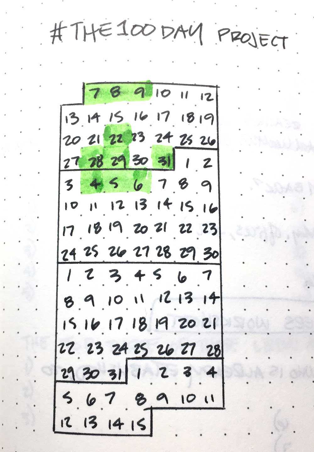
I may have only been in the studio a total of ten times the past 30 days, but I still think it is the right thing for me. I haven’t been in the studio every single day, but that’s okay. No, it isn’t ideal. Yes, I’d like to be in the studio every day just like I’d like to work out every day. Do I need more discipline? I know I do. But things come up all the time.

My grandmother passed away not a week after I started the challenge, and it took a few days to get back in the studio after that. That’s been a more difficult adjustment for our family than we expected.

Then the kids finished up their school year, and we as a family had to find new routines. We are still figuring that part out. So it’s somewhat slow going, but at least it is going.

We did take the kids to the Frist Art Museum (formerly known as the Frist Center for the Visual Arts) on Memorial Day and I got it on video! They recently rebranded and reopened the newly renovated Martin Art Quest.

And so far I have worked on three paintings. That’s a lot better than zero, right?

So yeah, despite the apparent lack of studio activity the past month, there’s a lot happening beneath the surface. Lots of ideas swirling around in addition to normal family stuff. The ideas are not really all that well-formed yet, but they’ll grow. I keep sketching and writing.

Abstract landscape with pink and orange sky Abstract landscape with yellow and purple sky and a high horizon Abstract landscape with yellow and blue sky and jagged red horizon

I just remind myself that while things are slow right now, they won’t always be. And when things get busy, I know they won’t always be that way. Life is always in flux. But I cling to routines like my morning coffee and Bible reading (and if there’s time, painting and a quick workout).

What do you do to stay grounded when things are constantly changing, or when things get slow?

How I Painted Yoda’s Swamp on Dagobah

April 5th, 2018

Growing up, I was not a huge fan of Star Wars. I guess I was kind of the oddball since a lot of people I grew up with were into the franchise. I’ve always liked sci-fi, but Star Wars exists in its own kind of category. It blends robots and advanced, yet ancient technology with mysticism and space travel, tying everything together with age-old monomyth storytelling.

I got into Star Wars gradually. I saw “Return of the Jedi” in theaters. I loved the Ewoks and hated that my mom covered my eyes when something blew up. I read the graphic novel version of “The Empire Strikes Back” as a kid. They re-released “A New Hope” when I was in high school. Then I re-watched the original trilogy multiple times in college and went to the opening night midnight showing of Episode I. (My buddies and I said two things: Queen Amidala is hot, and Jar Jar Binks is annoying.)

But as the franchise has expanded and my own kids have taken an interest in it, I’ve grown more fascinated with the overall story and mythology.

A few weeks before Christmas 2017, I decided to offer small painting commissions in time for the holiday

Right before Christmas, I advertised painting commissions for Christmas gifts, featuring the “Hoth” painting I did a few years ago. A girl I used to go to church with hired me to do something Star Wars themed for her husband.

I was pretty excited because after I painted “Hoth,” I got the idea for how to do something with Yoda’s swamp. When I painted “Hoth” I struggled with how to adapt it to my drippy, abstract style and wasn’t sure how to integrate that into an actual landscape.

I managed to form the drips and scrapes into an illustrative landscape. I wanted to to try something else in the Star Wars universe, and Dagobah was the first thing I thought of.

Trust the process

I knew first of all that Dagobah would be green. I felt the best way to create Yoda’s swamp was to layer lots of drips to create the impression of trees and vines in a swamp.

So I started with my usual overall orange tone on the canvas (you can see a little bit of it in places) and dripped thin, blackish paint from what would be the top of the canvas, flipping it around once I was satisfied.

I built up blue-gray layers to give it a misty haze. Some of the drips became thick tree trunks, and swoopy lines began to suggest vines hanging down. I sliced in some muddy, greenish water and surrounded it with mud to create the foreground.

The quickest, funnest part was sketching Yoda himself by the water. I dabbed in bright yellow dots to suggest light inside his little house in the bottom of the tree. It’s warm inside Yoda’s little hole, so a wisp of smoke snakes up from a tiny chimney at the base of the tree. Of course, Luke Skywalker’s X-Wing is stuck in the muck.

It’s a pivotal scene for Luke because he is on the cusp of becoming a Jedi, but so much doubt and fear holds him back. The murk of the swamp reflects his current state so well. He’s confused and uncertain of his own abilities as a Jedi. And Yoda is the one to help him get to that next level.

Brad Blackman, "Dagobah," 2017. Acrylic on canvas, 8x8 inches

“Dagobah,” 2017. Acrylic on canvas, 8×8 inches (Not for sale)

At any rate, it was cool to create that swampy, humid, misty atmosphere.

As I painted it, I thought surely they filmed it in Louisiana or Florida or someplace like that. I did some digging online, and apparently it was filmed on a sound stage. That had to be one cool set.

I’d like to try a bigger version of this to really capture the details, depth, and atmosphere of the swamp. I’ve found the secret to painting mist is to paint what you normally would, and then obscure it with lots of thin, gray layers.

You can have one, too

If you’re interested in getting your own commissioned Brad Blackman painting, just head over to the commissions page and shoot me a message. I mostly do abstract landscapes, but I’m open to more Star Wars themes. ?

Behind the Scenes: Painting 4 Canvases at Once (Time-Lapse Video)

September 22nd, 2017

On Labor Day Weekend 2017, I challenged myself to put 4 canvases together and paint them all at once.

The Call to Adventure, 2017. acrylic on canvas, 8x8 inches

The Call to Adventure, 2017. acrylic on canvas, 8×8 inches. $45
What emerged was not so much a specific scene or a quadriptych in the true sense of the word, a four-part painting, but rather four parts of a larger cycle. I think this is going to be part of a series.

They Look Like Each Other

Crossing the Threshold, 2017. acrylic on canvas, 8x8 inches
Crossing the Threshold, 2017. acrylic on canvas, 8×8 inches. $45
It took a long time to see where these were going. I started out with a vague sense of a horizon going across all four canvases, loosely connected to each other. Then I built up the canvases with color, and each one had a slightly different color scheme. Yet there are colors and textures that tie everything together. They all have a horizon line and have a warm color palette with flecks of gold throughout, with rough dabs of color around the edges of the canvas.

Part of Something Bigger

Belly of the Beast, 2017. acrylic on canvas, 8x8 inches
Belly of the Beast, 2017. acrylic on canvas, 8×8 inches. $45
It wasn’t until several days after I finished that I realized they were part of a much bigger set that I haven’t painted yet: The Hero’s Journey.

All great stories follow the Hero’s Journey pattern: the protagonist is called to an adventure, or to do something out of the norm, and resists, but is met with someone who helps him/her. They go through a series of trials, and ultimately confront “the Big Bad” and claim the ultimate reward, then return to their old world a changed person.

Summit, 2017. acrylic on canvas, 8x8 inches

Summit, 2017. acrylic on canvas, 8×8 inches. $45
If you’re interested in purchasing one of these paintings, you can contact me directly and I can set up a PayPal invoice or a Square purchase link for you.

How something gross became a metaphor for finding peace

September 7th, 2017

A couple of years ago, I was cleaning the tub, and the inspiration for this piece came to me.

Yes, the tub.

I know. It’s gross. I had to clean out some hair that had accumulated around the drain stopper in our bathtub. The end of the stopper was discolored from some harmless oxidization, and it created an interesting brown and turquoise pattern.

I wanted to replicate that pattern in brighter colors, so I swapped the brown for orange and shifted the turquoise to blue.

As usual, the painting took on a life of its own

Toward the end of painting this, the canvas started looking like a landscape. I flipped it upside-down to find earth and sky.

For some reason, this horizon motif keeps turning up in nearly every painting I do these days. I think there is something powerful and primal about the way the human eye looks for horizons.

I have to trust the process. “Trust the Soup,” as Steven Pressfield says in Do the Work.

The name

I asked my wife what I should call this, and she gave it the name “After the Storm.” I think it underscores a deep desire to move on past the current storms of life and get to the next stage that will hopefully be more peaceful.

And peace is what I pray for. Not so much a lack of storms, but the ability to remain at peace in the middle of the storm. The calm is the reward.

"After the Storm," Brad Blackman, 2017. Acrylic on canvas, 8×8 inches. 
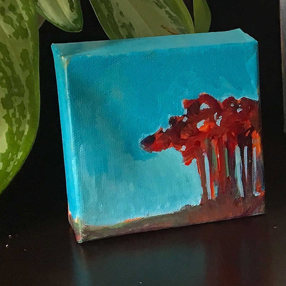
“After the Storm,” 2017. Acrylic on canvas, 8×8 inches.

If you’re interested in purchasing this painting, please visit the page for it in my shop.

Painting “Rebirth” (Time Lapse Video)

June 29th, 2017

As I grow and mature I realize how there is a little bit of all of us in each of us.

This really shows in this painting time lapse video of “Rebirth.” On the surface, it is an abstract sunrise (or sunset). But when you dig deeper you see how all the colors are connected to each other. Likewise, we are all connected to each other.

Texture and Depth

One of the things I find most interesting when I paint is the development of texture and luminosity by layering paint. This literally gives the canvas depth.

Originally this painting was going to start with a purple base, but I decided to go with a light orange. I built on that to develop a sort of sunrise/sunset mood, playing up a blue-and-orange color contrast. These seem to be common themes for me lately.

Getting Bold

The more I paint, the more I find myself getting bolder. For a long time I avoided colors like black and green. Now I embrace them and allow them to shape the canvas. I tend to put down black (or very dark gray) and then build the colors on top of that.

I suppose in a way it is a throwback to the Renaissance grisaille method, where colors are glazed on top of a gray painting. This ensures strong values and tight composition before color even goes on the canvas.

Back Up

I had already added my signature when I realized it needed something to tie the entire canvas together. So I added splatters in white, green, and orange. That way there is a little bit of those colors throughout, and not confined to one area.

It reminds me that there is a little bit of all of us in each of us.

Everything is connected.

Brad Blackman - Rebirth, 2017. acrylic on canvas, 8 x 8 inches

Rebirth, 2017 Acrylic on canvas, 8 x 8 inches

How I made a drab painting delightful

May 4th, 2017

It’s no secret that I’ve long been fascinated by manmade structures like overpasses and the way they react to the elements. Sometimes they compete with the landscape and at other times they complement it.

This is a theme that’s been showing up in my paintings the past dozen years or so.

This time, I started out by covering the entire canvas in light yellow, and sketched in the forms with a dark gray and let it drip all over the place. At that point I let it sit for a few weeks as I wasn’t sure what to do with it.

After letting it marinate I took a snapshot of it on my phone and threw it into Mextures or Snapseed (or both, probably) and played with it until I came up with a concept that I thought might work.

It turns out this orange-blue-green color scheme works really well. The composition was already strong but it needed something else. I didn’t know what. Using a couple of apps on my phone helped me figure out a color scheme that would make it all come together. This is when just playing around or making a lateral move can solve problems. This change in perspective helped me see it better.

So I added blue-green and orange in the sky to create a nice color contrast. I saw deep reds in the ground so I pulled those out. Push the darks and lights back and forth here and there.

My signature drips eventually disappeared but I am happy with the end result. It’s such a celebration of color and form!

It was a lot of fun playing with this one. I’m selling it for $40 on Instagram.

So head over to Instagram, click the heart if you like it and let me know if you’re interested by typing “SOLD!” in the comments. I’ll send you a direct message so we can work out PayPal and shipping arrangements.

UPDATE: This painting has sold!
Artists: if you get stuck on something, it might be a good ida to let it sit on the back burner for a while, like I did with this one. Let it marinate, and maybe try taking a photo of the canvas and manipulating that in a photo editing app to see it a different way.

The One Thing That Made My Painting Studio More Effective

April 20th, 2017

Have you ever cleaned something up to make it more efficient and later discovered that you actually made it worse? Well that’s what I did a year ago in my studio. I tried to rearrange it so there was more open space, but I actually made things more difficult for myself. Here’s how.

For years I’ve had my easel in the corner.

To the left, I had finished canvases as well as stretched canvases that hadn’t been touched. To the right of my easel was my work table, with all my paints, brushes, mediums, small canvases, and various tools. The tripod base for my easel allows for the back leg to fit in the corner easily.

However, I had a hard time painting on anything taller than about 32 inches due to the sloped ceiling. Everything I painted on would rub against the angled ceiling and I’d end up getting paint on the ceiling.

Before we moved to this house I tended to paint on larger canvases. 36 inches was actually kind of a small size for me back then. I missed painting larger, and my space needed to accomodate larger canvases. So I collapsed the back leg of the easel, leaned entire thing against the wall at a very slight angle and put the work table on the left, in front of those stacks of finished and untouched canvases.

That worked for a little while.

It opened up the room a bit. However, in the middle of last summer I decided to several canvases on the floor and paint them all at once as sort of a large polyptych.

Having the table out of the way worked well for this. For a little while.

I quickly came to the realization that while I had opened up the room, I had put my paints and water bucket and brushes and all my other tools on the wrong side.

I’m right-handed, so putting my table on the left made no sense. I was reaching across myself to reload my brushes!

So recently I moved the art table back over to the right side of my easel.

We got rid of the sleeper sofa that we never used and put the kids’ IKEA easels there. Now the bonus room is an art room for the whole family! The kids love it.

I guess the one thing was really two things: I moved the easel to the right since I’m right-handed, and we got rid of the couch that just held un-folded laundry.

The only problem now is that the kids like to sneak in there unattended and get into the paints. And they forget to put the caps back on!

Recapping Art Every Day Month 2016 (#AEDM2016)

December 17th, 2016

This was the third year in a row that I’ve successfully participated in Art Every Day Month. AEDM2016 was a lot of fun, though I hit a wall early in the month when I got sick. But I took on a sub-challenge that helped me get through it.

Out of a possible 30 days I only got in 10 days

The first few days of the month it took a while to find my groove. I started out working on a painting of Superman that I started for my four-year-old, but that was actually kind of hard for me. Abstract has become my default way of working. Painting superheroes is entirely different.

Then about a week in, I got sick! I don’t know why I forget I tend to get sick almost every November due to the changing seasons and weather. I ended up with a sinus infection as well as pink eye! So I missed a few days from being sick and then just recovering. (I haven’t been this sick in some 11-plus years.) Going forward I need to be more careful about how I budget my time and energy… how do I prepare myself for November physically, and stay in good health?

But on the days that I did get in the studio I got some good work done, especially going into December. Overall I’m pretty happy with the work I did.

What worked?

I’ve discovered that people really like the abstract pieces I do that resemble sunsets or sunrises. The other thing that worked really well was a gold bar motif. I sold a number of small paintings with a similar motif. I don’t know what it is about the gold but people really seem to like it.

Around Thanksgiving I got an idea from my friend Jeff Bertrand to do a bunch of small affordable pieces. He has an entirely different style from mine (pop surrealist cartoon characters and singers and movie stars) so I didn’t feel like I was copying him too much, although he told me to “get my own tots.” 🙂

But it was fun to do about ten eight-by-eight-inch paintings and sell them for $30 each. I did not make a lot of money off it out. In fact I barely broke even. But the goal was to get my art out there. Not to make money. But to get my art on people’s walls. And that worked!

What didn’t work?

I discovered that yellow is a difficult color to work with. Especially when combined with gray and off-white. It looks really sharp if it’s done right, but it’s very difficult to pull off. So my hat is off to Hyunmee Lee who I’ve found and admired on Pinterest.

It is still very difficult to create light in paintings. I think it has something to do with the additive nature of the paint. The more paint you put on, the darker it appears. You can always add more white, but sometimes the white can be blinding. It’s all about striking a balance between the light and the dark. That’s something I’m learning, and I’ve been painting for years.

Videos to come

I still have a number of time lapse videos to put together. I have the raw footage on my iPhone but I haven’t stitched any of it together yet. So be on the lookout for time lapse painting videos in the next few weeks.

How to Create a Studio Space

September 27th, 2016

My first studio was a little (child-sized) table in a corner of my room. I was about 10 years old, and I wanted to draw cartoon characters.

A few years later, I graduated to a small drafting table, complete with an adjustable angle. I kept my drawing tools in a caddy on top of a file cabinet. I drew comics.

I don’t have any of that stuff now, but it was great to have my own little spot to draw in. It was my own little world.

A Dedicated Space

What was great about it was it was a dedicated spot for making my art. I think that’s important for anyone pursuing anything creative. Just like arriving at the office puts you in a frame of mind to get work done, or even putting on your gym clothes can mentally prepare you to work out. Settling in to your work space can get you ready to do your work.

Your workspace might be in the living room, and you set up your easel after everyone else in the family has gone to bed. Maybe you draw at the kitchen table. Or set up an easel in your apartment’s kitchen and turn on the exhaust fan while you paint with oils and hope the landlord doesn’t find out. If you’re lucky, you might have a spare room to turn into your studio. Or a backyard shed!


Sure, I’d love to have a huge studio with gorgeous lighting like the things I find on Pinterest. (Yes, I have a whole Pinterest board that is just pictures of amazing art studios. I know. It might be a problem.)

Even if you have to set up and tear it down every day, carve out your space and make it yours. Because having a dedicated space will help you get in the zone and stay there. Put up quotes and photos of things that inspire you and make you want to do your best work. If you’re right-handed put your brushes, pens, paints, whatever on the right side so you’re not reaching across to get to things.

The idea is to make it a place you are comfortable and ready to activate the creative side of your brain.

What Not To Do

It’s entirely up to you to go around lighting candles and putting on great music and all that. Personally, I think that would be more of a distraction and, if we’re honest, really another way of procrastinating. Remember that time on The Simpsons when Lisa decided to write a book? (The Book Job)

Yeah, she got sidetracked trying to make everything just right. Meanwhile, her dad and brother and a bunch of other people managed to write a best-seller in shorter time. But that’s beside the point. The point is to not get distracted trying to make your work area “perfect” but to just go ahead and do the work.

All right, so what can you do right now?

Without going into a lot of detail, the first few things that come to mind are things like the following:

  • Find a corner and set up a table or easel there. It doesn’t have to be fancy!
  • Convert a spare room into your studio
  • Use part of the guest bedroom
  • Your former “dump zone” (you know exactly what I’m talking about.)
  • Convert the dining room and eat in the kitchen instead
  • Take over the garage (make sure you have proper heating, cooling, and ventilation)
  • Get a nifty table that can fold up and store things
  • Use a cart to store your supplies on, which can easily be moved around

My point is that there are a lot of ways you can set up a studio. And if you are on the move, carefully set up your bag, pouch, box, whatever you carry around, so you have just what you need and no more, so that you can make your art anywhere.

My question to you:

What are you doing to make a space to work?

How to Make Art with a Day Job

September 15th, 2016

Most of the artists I know have a day job since their art doesn’t pay the bills, or not all of them, at least. It takes a lot of time and effort to get to the point where your art career is your primary source of income, but it is doable. I’m on that same journey myself: I have a day job as a graphic designer. That’s what pays the bills.

The problem is, having a full-time job makes it difficult to find the time and energy to make art. In addition to spending time in the studio, you have to promote your work and show your work and deal with the business side of things.

But how do you work around your day job?

Well, what it really comes down to is making time and being disciplined about the time you have available.

Something I’ve done in the past is create an ideal week schedule. My friend Dave Delaney has a version of this that he calls the #KillerCalendar. Mine is similar.

What you do is create a new calendar in Google Calendar with events that recur every week (or whatever frequency works best for you). When you add new events or commitments, turn your ideal calendar on or off in Google Calendar and you can see whether your appointments line up wth it or not.

But first…

Before you do that, you have to make a fair assessment of what time you do have and what you need to do without in order to do your art. This is where it gets tricky, because you’ll find yourself having to cut out something you enjoy so that you can work on your art. For me, it’s staying up watching stuff on Netflix.

It really comes down to 2 things: discipline and a schedule. Know what is worth sacrificing so you can make gains as an artist, and be willing to live with those sacrifices. If you tie these things together you’ll find the result very rewarding.

Let’s say you want to devote your Saturdays to working in the studio. But Friday night your friends want to go out. So you do… and don’t get home until really late. Next thing you know, you sleep until noon, and you don’t get started in the studio until 3 in the afternoon, and then your friends call wanting to go out again.

Maybe you should have told your friends on Friday, “hey how about tomorrow night instead,” gone to bed early, put in a full day’s work in the studio Saturday and thencelebrated your hard work by hanging out with your friends.

What are you committed to?

Since I’m a father of small children who don’t get to see a lot of me during the work week, I have to block out time to get in the studio. I tell my family, “okay, I’m going to work on these paintings on Saturday from noon to five, and then we’ll do pizza-and-a-movie-night.” They’re fine with that, because we’ve made a deal with each other. But I have to hold my end of the deal. They’re counting on me to do so. After that studio period is over, I go back to my family.

Forgoing sleep to make art?

A lot of people choose to stay up late to work on their side gig, but it’s probably better to get up early. You can do a lot more in an hour when you’re fresh than in two hours when you’re tired.

Not getting enough rest will only make you less productive. Some people see their lack of sleep as a badge of honor. “I’m more dedicated to my job/craft/whatever because I got fewer hours of sleep than you did.”

That’s insane.

There are better things to give up. As I said earlier, giving up Netflix is something I can deal with. For you it might be going out for drinks with your friends.

I don’t think sleep is one of the things you should give up since that is sacrificing your health. It’s not a very good trade-off. Yes, you are gonna have to sacrifice something at some point, but consider what are you getting in return.

(And if your friends complain that you’re not fun anymore because you’re spending time in the studio instead of spending time with them, maybe you need better friends who support what you are doing!)

Try something. See what works.

Try something for a season. A month is good. You can do anything for a month.

For one month, try getting up an hour earlier (and going to bed an hour earlier) and work on your craft before going to your day job.

You might have to change mediums to something that works better with your time constraints. If you paint in oils, you might need to switch to acrylics for a while. (That’s what I did.)

If you write, try haiku or 300-word blog posts.

The trick is to commit to regular practice that works with your time constraints.

Over to you

What’s something you can do for a season to do your art around your day job?

Header photo via Unsplash

Gearing Up for the August Art Crawl

August 3rd, 2016

The August First Saturday Downtown Nashville Art Crawl is upon us! I couldn’t be more excited. I’ve spent the last couple of weekends working on the art I’m putting in the show.

I’ve never done anything quite like this before.

What I’ve done differently about this set of paintings is I’ve created everything all at once. I usually work on one piece at a time. But this time, I laid out nine canvases on a big big drop cloth, and got to work on all of them at once.

Because they are being developed simultaneously, they all have a lot of the same colors and similar compositions that somewhat carry into each other from one canvas to another.

Part of that is because when I started, I made lines ran from canvas to canvas, but as I built them up, they took on their own compositions.

While the canvases are all being developed at the same time, I am developing each canvas individually. The result is really a small body of work where the pieces are all connected not necessarily by their adjoining areas but in terms of color and mood. Each piece will have something about it that stands out from the others. One color is be more dominant on one than another, but there is a common constant visual theme throughout. I am really excited about this project!

I think I like this technique: it’s fast.

It’s a very fast way to work. I’ve developed nine paintings all at once. Normally that would take a very long time. And in the process of developing this cohesive set of works I’ve come across a couple of new techniques that work really well for me, spreading paint with nontraditional tools. Painting on the floor is interesting because I usually work with the canvas on an easel.

And yes, there’s a downside.

The only downside to working on several paintings at once like this is, if one canvas is too wet to work on, the others probably are, too. But that forces me to sit back and look at everything to figure out what is next.

Slowing down is good, too.

So much of the process of making art is just staring and looking.

Stay tuned for the final result for this new work! If you can’t make it to Erabellum in the Arcade this Saturday night, to see the work in person, watch this space for the final work with some more time lapse goodness. (Feel free to subscribe to my emails so you can know when I get it posted.)

What I Learned from a Bad Painting

July 15th, 2016

I’ve written before about failure before. Recently I told you about why my art isn’t selling, and a while back I told you about a series that burned me out and ultimately set me back about 18 months.

Every Painting Looks Terrible at Some Point

Well, a few months ago, I painted something that was a total flop. I finished it and I hated it. But I pretty quickly knew exactly that went wrong with it.

Every painting – usually right before I finish it – feels like an utter disaster. I say To myself, “this is awful, this is terrible.” Most of the time I’m able to correct it or see it through to completion. But not this one. I did everything wrong.

Wrong Every Step of the Way

It was late one Friday night. The family had all gone to bed. I knew I wanted to get in the studio because I had the itch to paint something. I was exhausted, but I went in the studio anyway. I think I started about 11:30 at night. I got off to a late start because I had been goofing off on the internet instead.

I wanted to adapt a friend’s Instagram photo from his trip to Iceland. It was a beautiful, austere image of some rocky, snowy mountains in the far distance. Very minimal, very powerful! very Nordic in the best sense of the word. The sky was dark. If you weren’t careful, you’d miss the mountains and the field of snow. It was a scene of subtle power.

This was right after I announced I wanted to get away from all the dark tones, but they crept back anyway. Plus, I wanted to make the work my own. So instead of aping the gray tones of the original photo, it somehow turned blood red.

For some reason I decided to broadcast it on Blab.im.

I was spending more time dealing with trolls than painting. Somebody was trying to be a troll about my name, asking me why I was white, because my name is Blackman.

I was too tired to even deal with it. I just thought, ‘dude go away, you’re bothering me, leave me alone.” It’s hard to talk and paint when you’re not used to it, or not doing a demo that doesn’t require a lot of thought. I was too tired to realize I was being trolled until later.

The final result:

It’s okay, but I don’t feel like it’s my best work, either. It’s certainly not what I was going for.

A day or two later, I made some observations and realized what I had done wrong, and thus had some new tools for doing it better the next time.

Lessons learned:

  1. You can’t waste time on the Internet and expect to do great work.
  2. Don’t get started when you’re really tired. Some ppl work best at 11:30 at night. Well, I don’t. I’m not sure what my best time to work is. But I can tell you it’s not late at night.
  3. Have some idea of what you’re going to do before you get started. You don’t have to know everything, and I’d advise against knowing everything because that doesn’t allow for improvisation, but at least have an inkling of what you want to do. I hadn’t planned very well.

I went to bed feeling like a failure that night. But I shouldn’t have.

The reality is I should have recognized my own low energy level and just gone to bed. There are times when you push through your blocks. At other times you just say, “this is not the right time for that.”

That wasn’t a block. That was exhaustion. I probably could’ve done better if I had gone to sleep and thought more carefully about what I was going to paint.

Failure is a Better Teacher than Success.

Every failure has a lesson, and you can learn a lot that way. What are some things you’ve failed at and learned from?

What Does My Past Say About My Future?

July 1st, 2016

They say to know where you’re going, you have to know where you’ve been.

To look back is a chance to predict where your trajectory goes. Maybe you like where you’re going. On the other hand, if you don’t like that path, you can change course.

Building Bridges

Back around 2002 or 2003 I was working in my first full-time graphic design job out of school. I was doing a lot of driving from one side of town to the other. I was making a lot of road trips, too.I became fascinated with the patterns of light and shadow created around overpasses when the sunlight hits them.

Overpass, 2003. Oil on canvas, 24 x 30 inches

I began recreating those on canvas in exaggerated color, eventually highlighting the textures and decay in the concrete texture.

I also used exaggerated colors in portraits of my friends.

Jennabeth, 2003. oil on canvas, 22 x 22 inches

I would make reference photos with my Canon SLR, get the film developed, scan the prints into Photoshop, manipulate the colors, and print them on the big color printer at work. Often I would make a grid on my printout to more easily transfer the image onto canvas. That was my process.

Dorm Room Conversations Expressed on Canvas

The urban imagery got me thinking about the impermanent nature of our lives here on earth. I believe God made us to be eternal, but due to our brokenness our bodies are mortal. (God created a way out for us, but that’s a discussion for another time.)

In our hubris, we keep building monuments to ourselves, but nature erodes them. Our grand buildings and structures inevitably fall apart.

It sounds like the stuff of dorm room conversations, and since I was right out of school, that’s about right. (I miss those late-night philosophical discussions about the meaning of life. Those were the best conversations ever.)

Melrose II, 2004. Oil on canvas, 30 x 30 inches

Eventually, I felt like I maxed out on bridges. I had made somewhat of a name for myself painting bridges, but I got tired of it and I don’t like painting the same thing over and over, so I felt like I had said everything I could say about it. I got bored.

I wanted to pursue a sort of abstract realism, but never quite got the hang of it. The idea was to make a drawing based on real structures, but flattened them with simple colors in paint.

And the Inevitable Burnout

Nashville365 Series, Number 3: Meade, 2011. Oil on canvas, 5 x 7 inches

I gradually transitioned from bridges to downtown facades and urban scenes, but I got bored with that, too. I got tired of the small scale and high level of detail. Yet in the back of my mind I kept coming back to abstraction, but didn’t know how to make that transition in a way that made sense in respect to my previous work. Why would somebody who paints urban landscapes suddenly switch to abstracts? It didn’t make sense in the grand scheme of my work.

It Took a One-Month Challenge to Get Me to Change

But after not really doing anything for about 18 months, I finally made that jump into abstraction with a month-long challenge. I needed a challenge and trying something new and different was just the thing to get me back into the studio after burning out.

I noticed that my new abstracts look like close-ups of the very concrete on those bridges and overpasses.

In fact, I now will go and take pictures of concrete and plaster and stuff like that that’s all weathered and veined. Only now I take those photos on my smartphone and manipulate them with an app like Mextures and not Photoshop. I don’t draw on the canvas, either. I just start with the paint and get going based on a loose concept in my head. And right now the concept usually centers around color and a mood more than anything.

What’s really wild is those loopy lines from those flyovers are starting to come back. I like the big, long curves of flyovers. It makes for such an interesting abstract form when flattened onto canvas.

What’s Old is New Again

Interchange, 2004. oil on canvas, 30 x 40 inches

Bend, 2016. Acrylic on canvas, 14 x 11 inches

So I have started incorporating bridge-like structures back into my paintings. It’s been fun bringing this back into my paintings after all these years.

Even though I went kind of “gray” for a while, I’m excited to bring back the colors and forms that got me so fired up about painting some 14 years ago. Fortunately I think this is something I can keep doing a lot longer.

Will I still be doing that 14 years from now? I have no idea. But if the past is any indication, there will at least be some part of that concept in my work.

My Painting was Drab and Dark, So I Did Something About It

June 15th, 2016

Back in January 2016, I participated in the First Saturday Art Crawl by hanging some work in Erabellum Gallery in the Arcade. When I saw all my work together on the wall, I was stunned at how dark everything was.

This was about the time I resolved to get more color and life into my work.

By the time the April 2016 Art Crawl rolled around, I had my chance to show some new pieces I had created that were colorful and broke away from the “dark horizons” I had been doing the past couple of years. I don’t know if I just get bored easily, but I do think it was time to experiment with color again.

I had to carve out some time to get in the studio and explore some new ideas to supplement last year’s work. I was pretty happy with the result. You can see how it looked on the wall here.

New work up at @erabellum in the arcade! Come say hey if you're at the #FirstSaturdayArtCrawl

A post shared by Brad Blackman (@bradblackman) on

Pressure, 2016. acrylic on canvas, 20×20 inches

Bend, 2016. acrylic on canvas, 14 x 11 inches

Scattered, 2016. acrylic on canvas, 16 x 20 inches

I wound up donating two of these to the Music City Derby Day silent auction.

As of right now I’m planning on participating in the August Art Crawl. I’d love to participate in the July Art Crawl, but don’t have the time or the space to work on the pieces I have in mind to have new work ready in time, so I’m shooting for August. I have some ideas I can’t wait to try out. I’m thinking even larger next time, with a more cohesive set of works.

Taking Things a New Direction

March 15th, 2016

You may have noticed my paintings have grown progressively darker over the years. It was a surprise to me, but boy did I notice at the end of 2015.

So this year, it’s my goal to paint lighter. I might have to paint dark for a while or from time to time to deal with some things lurking beneath the surface, but my plan overall is to bring back more light and peace into my artwork.

I’ll most likely continue the abstract landscapes I’ve been doing, but with a lighter approach.

It will be a change for me, but I welcome the challenge.

In addition to painting lighter, I want to experiment with video this year. I think video is a great way to look at art and talk about it since it is multi-sensory. You can watch a painting emerge and get a sense of the artist from the way he or she talks about the work.

I’m excited. I hope you are, too. Thanks for being here.

Looking Back at #ArtEveryDayMonth2015: 3 Things I Learned

January 26th, 2016

In case you missed it, I participated in Art Every Day Month 2015.

AEDM is a fun way to challenge yourself to make some art every day for a month. Doing it online builds in accountability. It keeps you motivated, and you see what other people are doing, so you know you aren’t doing it alone. That makes it more fun. You get better at doing art just from the practice.

And focusing my efforts in such a way that I wanted to achieve very specific things allowed me to actually accomplish something. So I set 3 goals. I also learned 3 things.

3 Goals I had for AEDM15:

1. Stay focused on a theme: abstracts inspired by British rock songs Sometimes limitations are an artist’s best friend. I love British rock, and there are a few songs I have wanted to translate to paint for some time. There are a few I didn’t get to. Maybe I will later.

2. Don’t try to paint a new piece every day. Do try to paint daily. It’s just like Like Jerry Seinfeld’s “break the chain” idea. But this isn’t always practical. That said, I did my best to avoid missing two consecutive days. Sometimes that meant I spent only five or ten minutes gessoing or toning a canvas. That was enough for me. Slow progress is still progress. Tweet that.

3. Experiment with painting live on Blab.im. Blab is a new-ish site that allows live video conversations that anyone can join or watch. It’s like Google Hangout without the complexity. It shows you in a Brady-bunch like setup. It created some interesting challenges. More on this in a minute.

3 Things I Learned:

1. I still love doing abstracts. It’s fun to hear what people see in them. Everyone sees something different.

2. British rock is rather dark. Even the “cheerful” stuff. Maybe it’s the stuff I’m drawn to. Or maybe this is characteristic of all rock-and-roll. After all, most rock concerts are held at night, in dark rooms. In my mind, music is almost always performed in the dark, with a piercing spotlight on the musician. Colors emanating from darkness.

3. Painting live online is the same thing as doing a live demo in front of an audience. I have to be able to complete something quickly and talk while painting. I need to work on my lighting and sound for painting live on the Internet

What’s Next?

1. I’m ready to paint something bright. The darkness is so bleak. I want some bright colors and light and hope in my art. There’s a place for the darkness, but I don’t want to live there.

2. I want to experiment with different surfaces. I’m thinking about trying wood and masonite.

3. I need to invest in some sort of simple video setup for doing better painting videos. I also need to come up with some demonstration ideas, things I can whip out in 30 minutes. I’ll probably be studying a lot of Bob Ross videos and other painters who are great at doing demonstrations.

Finally, next year I will probably refrain from blogging about it every day, but stick to just using the hashtag and posting to social media, with a blog post summing up the week or each finished piece. Blogging daily is a lot of work, especially when it is as image-heavy as this.

Did You Participate?

Did you participate in AEDM15 back in November? Or at least follow it online? I hope you did. If you didn’t, I hope you take on a similar challenge at some point. We’ll all be here to cheer you on.

Has He Thoughts Within His Head? Days 27-30 of #ArtEveryDayMonth

January 19th, 2016

On days 27-30 of #ArtEveryDayMonth, to finish out the British-rock theme I created this piece inspired by Ozzy Osbourne’s song “Iron Man.”

I must confess I never heard the Ozzy version until now. I heard the version by The Cardigans around the same time I was listening to Oasis, which would have been the mid-to-late 90s. Both versions are awesome.

It’s a great tune that makes you wonder about vengeance and who has a right to it.

Since iron is usually black but rusts to a reddish-orange color, those were the primary colors I used, with various blues for contrast. The overall image is nonobjective, but you can almost make out a landscape or even a face. My goal was to translate the song “Iron Man” into a visual.

I think I’ve done that.

Video below. (And no, it doesn’t have the actual song because of copyright stuff, even though it is a tribute.)

After all these dark paintings this month, I’m ready to do something bright now.

What does your space say about you?

October 21st, 2015

What’s in your space?

Our spaces say a lot about who we are. In many ways our spaces like our clothes. Not just an expression of who we are, but another extension of ourselves. It’s not only how we decorate our space, but the kind of spaces we find ourselves in.

Coffee Shops and Rock Clubs

Think about the kind of person who feels at home at Starbucks. I imagine he or she is probably different from someone who loves hanging out at a rock club.

Starbucks is brightly lit and relatively quiet. The hardest drug around is a super caffeinated espresso drink with a bunch of chocolate in it. Soft jazz-pop plays in the background. Baristas banter with each other.

A rock club is a different story. It’s dark, loud, and plenty of liquor is available. Other things if you know where to look and who to talk to. Everyone is yelling at each other. There’s an energy in the air. Sometimes there’s a sense of desperation.

Starbucks is decorated in earthy tones and textures. The few rock clubs I’ve been to have concrete floors and black spray-painted walls and glaring neon signs and blinding colored lights on the stage. And odd smells.

Your Home Away from Home

Think about your home. Or your office. Or think about your middle school locker. Your dorm room in college. Your cubicle at work. The truck you drive around town. How do you decorate that space?

The space you find yourself in most often might be a quiet office or a noisy construction site.

How do you make it yours? A lot of people put personal things on their desks. Or pictures of loved ones on their dashboards.

What is in Your Space?

Are you intentional about your space? Are you putting the right things in it? Are you in the right space to begin with? While that requires a bit of soul searching, you can easily put a few things in your space to make them more “you.”

Fill your space with photos. Tchotckies. Art. Mementos.

My Space (not that social network)

Personally, I like my space to be well-lit. Quiet with warm textures. (And yes, I happen to be writing this in a Starbucks.) Artwork that inspires and fills me with a reflective attitude that makes me focus. Colors and textures that open my mind to what can be and should be and shall be. Music that puts me in a zone for creating something beautiful.

Whenever I’ve had a desk at a job somewhere I’ve made sure I put up things that speak to who I am, whether it was things that inspired me as a designer or reminded me of my family. I’ve had a picture of my newborn daughter, a coffee mug with a picture of my kids on it, and typography charts, among other things.

In my painting studio I put up reference photos and the work of artists I aspire to be like.

What Does Your Space Look Like?

The holidays are coming up fast. The new year will be here before you know it. Why not put some art in it that makes you stop, slow down, and breathe amidst the chaos of the season?

Or maybe something that kicks you in the pants and keeps you going so you don’t give up? To stay motivated for the end of the year. Then kickstart the new year into high gear.

I just hope you will take the opportunity to own your space and make it yours.

Start Creating Your Space Now

What will you do to personalize your space and make it into a sanctuary where you can do your best work. I want to help you do this by creating art that you can put in your space, no matter how big or small it is. What do you want in your space?

With the holidays coming up, I’m taking commissions between now and the end of November, 2015. I’d love to create something perfect for your space.

Do You Want to Get Better at Painting? Master These 3 Skills

June 10th, 2015

If you want to get better at painting (and you might not; there is a market for “bad” art) I have found 3 important factors that will do a lot to sharpen your painting. If you learn the basic skills of drawing, composition, and using color, you will go a long way to getting better.

Drawing

This is where you parse what you see or think and make it come out of your hand. Even if you work in an abstract or non-representational mode, you still have to be able to draw. It is how you translate what you see, think, and feel onto a two-dimensional surface. Or to prepare to create a three-dimensional object.

Drawing is the basic means of visual expression. You learn to divide things up by line, texture, volume, shading. You understand the weightiness of things or the wetness of water. You grasp how to form and reuse symbols. You learn to see things as they actually are, and to question what you actually see. What are you actually seeing?

In this way, drawing becomes a metaphysical exercise.

Composition

In college I took Drawing and Composition I and II, so my drawing skills and composition skills grew stronger at the same time. The two go hand in hand. Composition is arranging things within the picture plane so they harmonize with each other.

It is also editing. Unless you edit what goes on in your picture, your sculpture, your film, your song, you will have more information than the audience knows what to do with. You have to be able to edit what you see or what you are visually expressing in such a way that it accomplishes your goals. The way you arrange things lets you tell a story or express something. If something is right in the center of your picture it will naturally be more prominent. If something is partially hidden, it might be part of a slow reveal.

All art is editing.

A post shared by Brad Blackman (@bradblackman) on

Ultimately, all art is editing. (Tweet that)

If you don’t edit, you just have raw sensory data. That data has to be filtered in some way. In order for it to be anything, to express anything. Otherwise if it isn’t filtered, it is just noise.

Maybe you want your viewer to decide what they make of it, but when you do that, you open the floor for interpretation. Nobody knows what it’s about.

So when we encounter something we are unfamiliar with, we apply whatever the closest thing there is in our own internal narrative. What you experience right at this moment is influenced by what you have experienced before. It is only babies who have no previous experience.

(And I wonder how much of an impact things that happen in utero carry over after birth. I am convinced that certain songs resonate with my children because I sang them before they were born. I would put my face next to my wife’s belly and sing.)

What composition does is it gives everything a place in the world, certain clues to the viewer about what they are supposed to take away from the piece.

Color

This is one of my favorite aspects of painting, despite a ten-year period where so much of my work has been pretty gray and brown. But those works are of urban spaces and highways, and well, those things are pretty much gray and brown. (It’s amazing how many things are almost no color at all, so many of dull shades of non-color.)

Color gives spice to life. It gives paintings an energy that would not otherwise be there.

There are a lot of ways of seeing and teaching color, ways to look at color schemes. Unless you have a good sense of how colors work together, how colors work… You have to understand that colors are influenced by other colors. They don’t exist in isolation. Even the canvas itself is influenced by what ever else is in the room. You have to understand the nature of colors and how colors interact with each other. Not just one color, but how to combine them and mix them.

Learn the Rules, then Break Them

I hope by now you can see how mastery of these important skills will go a long way to improving your paintings. Master them, then figure out how to break them. That’s why sometimes the “bad” art isn’t so “bad” after all. Picasso, for example, was an excellent draftsman. He mastered drawing and rendering. Then, he decided to explore the nature of how we see, fracturing the world into a million tiny pieces, thus contributing to the development of Cubism and the rest of Modern Art.

Which of these skills are you going to develop?

Pin this post:

Images from New Old Stock  Brushes from my own studio.

The 4 Disciplines Every Artist Needs to Master

April 20th, 2015

Making art is hard. Creative expression is fun and rewarding in itself, but if you want to do anything with it you have to have discipline and work at it even when it becomes difficult. I’ve found 4 disciplines that every artist needs to cultivate in order to do better work.

Let’s start at the end.

4. Knowing when to step away without giving up

With every painting I make, I reach a certain point where I hate it. It’s the worst thing I’ve ever painted and I think I’m an utter failure.

It’s usually before something clicks and it starts coming together. Now, I have tricks to get past this stage sooner or more quickly. (Usually it has to do with getting lights and darks in earlier.)

But the point is we all face this. Seth Godin has a book about this, called The Dip. The idea is that every worthy endeavor has a point where there is a decrease in drive and excitement and an increase in frustration. And it is usually right before the project really takes off. I haven’t read this book yet but it’s been on my list for a long time. (I don’t even have a copy. I need to get one!)

When this happens in the studio, this is when you should take a 20 minute break and go for a walk. This does a lot to clear your head.

As for your business, this is when you just don’t give up. Change sales tactics, maybe. Read Seth Godin.

3. Setting goals that are just beyond your reach

You have to be realistic with your goals. But you have to stretch just a little bit. And sometimes you have to look for ways to set yourself up to succeed at those goals.

For example, a friend of mine wanted to complete 200 paintings last year. In October she only had 100 paintings finished. She didn’t think there was any way she’d make her goal. However, in November, she tried the Art Every Day Month challenge. She changed her goal from 200 paintings to 200 pieces of art, and accepted small sketches as part of her goal. This pushed her past the 200-piece limit.

So put your goals just beyond your reach so you have to stretch, but allow for some flexibility in those goals.

2. Staying open to change

Making art requires a certain amount of openness. You have to understand and embrace flux, the changing nature of art. Flux comes from the Latin word for flow. So embrace the changing, flowing nature of art, your environment, your inputs, your outputs.

Art is fundamentally transformational: it changes base materials from something inert to something that changes the person who experiences it. You turn stone into a sculpture. A canvas into a painting that moves people.

Embrace this transformation and be open to possibilities. Because without change and transformation, there would be no art.

1. Showing up

The War of Art. If you want to make art, you have to show up regularly. The muse won’t come to you until you’re predictable about it, and art-making is part of your routine.

My friend Jeff Goins likes to talk about how before he got serious about writing, every third Saturday he would sit on the porch with his laptop, wait for the wind would blow just right, and then write.

After doing this for a few months he had about a hundred pages of nothing. He realized you have to show up daily and do the work. So he did just that and after several years of hard work he’s a New York Times best-selling author.

You have to show up, put in the hard work, put in a lot of effort. Consistently making a lateral drift is not a long-term strategy for producing good work. You have to put in what’s called sweat equity. It’s not easy. But it’s worth it.

It’s like what Chuck Close said:

“Inspiration is for amateurs. The rest of us just get to work.” — Chuck Close
Pin this post:

So what kind of disciplines have you had to cultivate for your art practice?

I’d love to know. Shoot me an email, or go on Twitter and use the hashtag #artistdisciplines so we can continue the conversation there.

Or if you’d like, just leave a comment here on the blog.

What I learned from painting with my autistic son

March 24th, 2015

A few months ago, an old friend reached out to me on Facebook. I interned in her office many years ago but we’ve managed to keep in touch. My friend wanted to know if there was any chance I could donate a painting to a fundraiser for her son’s school, Benton Hall Academy.

Benton Hall’s mission is to “educate children who learn differently.” My friend’s son is autistic. This is important to me because my son Greg is also on the autism spectrum. Greg is high-functioning, but being a little different does create some challenges for him (and us). He’s a determined little guy who works hard and I think he’ll turn out all right. He’s getting a fantastic education in Wilson County. He’s a great kid.

So for the Benton Hall auction I decided I wouldn’t pick through paintings I’ve already done. I thought it would be a great opportunity to collaborate with my son. It might teach him to help other children who face similar challenges.

Except it didn’t turn out that way.

I don’t guess I really explained it very well because he thought we were just doing a painting together. This became apparent when he got really upset when we delivered the painting to my friend.

I had to promise him we’d do another one. (We should probably follow up on that very soon. I know he’ll start reminding me. Parental guilt is the worst.)

But he certainly had a blast!

However, there was no real plan when it came to the canvas we collaborated on. Initially I was just painting something I wanted to paint, primary-colored abstract that just wasn’t quite coming together like the image I had in my mind.


I was working at my easel. The boys were playing at their IKEA MÅLA easels, combining all their paints into one color  to make it blackish mud. That mud was cheerfully smeared onto the roll of paper.

Then the phone rang. It was my mom on FaceTime.

I had to step away for a minute so I could hear Mom over the little boy giggles. I looked over.

Greg had proudly put a blob on my canvas.

My heart stopped.

You painted on my canvas! You can’t do that! You messed up what I was doing!
But I caught my tongue.

And then I noticed…

It actually kind of worked. The blob looked like a black submarine.

Greg gleefully said it was as submarine and he started singing “We all live in a black submarine.” (If you can’t see the video, click here.)

(The Beatles’ Yellow Submarine Songtrack CD stays in the changer in my wife’s minivan. So it’s on heavy rotation on the way to and from school, church, Chick-fil-A, the grandparents’, anywhere else we might go. The kids love it and listen to it all the time.)

So I decided to keep it, and turn this into the collaboration piece for the auction. It wound up being a lot of fun.

Time-lapse video of him painting. (Can’t see it? Go here.)

The piece turned out to have two more black submarines on it, and Greg added the ocean below.

Three Submarines, Greg and Brad Blackman, February 2015. Acrylic on canvas. 12 x 12 inches.

I think it’s one of the more memorable father-son moments we’ve had together.

While I was trying to teach him something about helping other people, I think I got the most out of it.

I am incredibly blessed.

(AUDIO) How do you find motivation as an artist?

February 3rd, 2015

In another audio edition of my blog, I was thinking about some of the things that motivate artists. Of course, I speak best from my own experience, so the things that motivate might not be what motivate other artists. But I might be surprised!

Initially, I thought I might re-record this, but I think it came out all right!

What motivates me to make art?

  • Like most artists I know, I’m inwardly-driven. I crave validation on some level, but overall I don’t care that much about what everyone else thinks. (I’m definitely not a people-pleaser.)
  • My parents encouraged me a lot, but they didn’t try to steer me into one direction or another. They let me explore. Swim lessons, comic books, track, art lessons. I landed on graphic design and fine art.
  • I didn’t start painting until I was in college. I drew from the time I was 2 years old but painting wasn’t something I ever tried until college.
  • My motivation comes from some inner urge to make something. I think that is something that comes from God, as I am made in His image. God is the ultimate creator, and I create as well.
  • We make art because we believe our life matters in some way, and we are leaving a mark on this world to say that we were here.
  • It’s easy to get discouraged when you feel like your art isn’t good enough or that nobody will be interested. When that happens, step back and take a break to find something that inspire you. Things like color, texture, flavors, music, books, Scripture all motivate and inspire me to get out of my stuckness. Otherwise the motivation comes from somewhere within me.
  • The making often is the reward. It’s a self-rewarding process. This is why it is hard to put a price on your art. You’ve already been rewarded for doing the work since the work is the reward in itself. But we all gotta eat and pay the bills!
Well there you have it. Those are my thoughts on what motivates artists, or rather, me.

What motivates you? I’d love to know!

9 Composition Tips for Artists

October 7th, 2014

Recently I blogged about using frameworks/templates for blogging. Now I’m thinking about compositional techniques to jump-start your artwork ideas.

A lot of these are pretty common and pretty well-known, but I thought it would be helpful to collect them in one place. Let me know if something sparks an idea or two. It’s not meant to be comprehensive. It’s just a starter.

I’m going to start with the simple and get more complex as we go.

1. An Obvious Focal Point

First of all, your composition needs to have an obvious focal point. What are we supposed to look at? Using a horizon line or perspective is a great way to accomplish this because it establishes context, even in an abstract piece. Our eyes naturally gravitate to the horizon.

Example: In Sun and Snow, acrylic on canvas. 10 x 10 inches.

Abstract landscape showing a snowy field with a high horizon and a gold mass against the gray sky.

2. Figure/Ground (Dominant/Subdominant)

This is kind of obvious, but you need something in the foreground and something in the background. It is pretty basic, but you want people to know what is in the front, and what is in the back, even if what you are doing is flat. Another way to look at this is what is dominant or subdominant? You could have a dominant field with a small element that immediately calls attention to itself if it is positioned in the right place.

Example: The Battle of Hoth, acrylic on canvas. 14 x 11 inches.

"Hoth" painting surrounded by jingle bells and twinkle lights

3. Split it down the middle

Before you dismiss this as being boring or static, you can actually arrange things pretty dynamically this way if you do it right. I think of Josef Albers’ “homages to the square” series. There are concentric squares arranged on a square, weighted on the top or the bottom but centered on the canvas from side to side. There’s a certain elegance to things arranged in neat rows. It creates rhythm.

4. Think Horizontal / Think Vertical

Adopting an extreme creates an interesting composition on its own. Something that is obviously very vertical or horizontal creates a lot of interest just by being there. Emphasize it or counter it to make it even more interesting.

Example: Pilot of the Storm Who Leaves No Trace, acrylic on canvas

5. The Rule of Thirds

This is pretty well-known among most designers, photographers, and painters. What you do is you divide your field into equal thirds horizontally and vertically, so you wind up with a grid of nine equal rectangles or squares in the same proportion as the whole frame/field. Then just line your elements up along the grid, especially along the intersections of the grid lines. Remember there is a difference between asymmetrical balance and almost-but-not-quite-centered-so-it-looks-like-a-mistake.

Example: First Light, acrylic on canvas. 8 x 8 inches. (SOLD)

Hazy, abstracted sunrise in pink, orange, and yellow behind a dark purple landscape.

6. The Golden Section

This is more advanced, and somewhat similar to the rule of thirds but it gets more complex because you can arrange elements along the division lines and the curves, sometimes both if you want. It’s very common in a lot of Renaissance art and architecture. You can start with a Golden Rectangle for the overall frame or apply the proportions to the composition using that framework.

Example: Hope, acrylic on canvas. 30 x 24 inches.

(See how I used the Golden Mean on this painting.)

7. Odd Number of Elements

Even numbers of things get boring in a hurry and feel kind of static, unless you create variety in the way they are spaced. Odd numbers of things are inherently more dynamic. Think “three” and “five.” Interestingly, this is also where “sacred” geometry begins, especially as it pertains to the golden section (two, three, five, eight…)

Example: Three Submarines, acrylic on canvas. 12 x 12 inches. Painted with my son when he was four.

8. Avoid Tangents

When edges barely touch, or kiss, it creates a weak spot in your composition. Viewers aren’t sure what is in front or what is doing the overlapping. I avoid this by keeping my compositions relatively simple. I don’t use that many overlapping elements. (Related: don’t put pointy things around people’s eyes in your art unless you are trying to make them uncomfortable.)

Example: Melrose Interchange, oil on canvas. 18 x 24.

9. Break all the Rules!

Once you figure out how to do all these right, you can break the rules and get away with it. Of course often times when you do this you wind up with something of a pattern or a texture, or something so disjointed the irregularity becomes regular. Think of Jackson PollockKeith Haring, or Hieronymous Bosch. All three of these artists have so much going on in their art that they kind of defy the principles of composition, but their art just works.

Example: Everything is Connected, acrylic on canvas. 8 x 8 inches.

Does any of this inspire you to make something new? Let me know if it does! I’d be thrilled to see it.

Taste

August 12th, 2014

Taste, along with talent, is what usually gets you into art in the first place. You probably have a knack for what looks good, what doesn’t, what sounds good, what flavors go together and so forth.

A hunch?

You have a knack for pairing things, really, based on hunches but sometimes theory understood intuitively. Other people may not come up with it on their own, but they are pleasantly surprised when you do it.

Then of course there is the problem of “bad” taste. Combinations that disappoint. And sometimes what looks bad now might look great tomorrow, dated next week, yet beautiful and timeless a hundred years from now.

The definition is slippery, but taste is a real thing for sure.

While I’m certain taste starts with liking things (or disliking them, even), it goes beyond that.

I think good taste can always quantify and explain itself given certain principles that have been proven time and again. What we have to be careful of is that we don’t confuse taste for personal preference.

In short, it’s a sort of pursuit of excellence.

Ira Glass and the Gap

Ira Glass (the guy who hosts This American Life on NPR) has talked about the gap between a beginner and his taste. In short, you have good taste, but your skills don’t always match up. And that’s frustrating.

Video: THE GAP by Ira Glass from Daniel (aka frohlocke) on Vimeo.

Also, don’t miss the Zen Pencils comic-strip version of Ira Glass’ talk.

What’s been your experience with taste and the struggle in getting your skills up to the same level as your taste? Or do you even worry about it at all?

Photo Credit: visualpanic via Compfight cc

Small Victories

July 22nd, 2014

I’m ambitious. I want to paint something huge and monumental. Maybe something like one of Motherwell’s Elegies. In fact, I like to paint large.

As an artist it is so easy for me to get hung up on the fact that I haven’t done anything big or that I’m not working on something giant right now. It’s easy to get discouraged by that.

Then I get frustrated by the clutter in my bonus room studio and I feel blocked by the junk that has accumulated that prevents me from doing my work.

I have a goal for how many paintings I want to do between now and the end of the year, but I can’t because there is too much junk in the way. I want to get up at 4 in the morning and do the work I desperately need to do, but I can’t. There’s too much clutter.

Or so goes my thinking.

What I can do is get up that early and — gasp! — clean up the bonus room.

I bet I’ll have the studio ready in a week or less. You can do a lot with just an hour a day.

Here’s the point: there are lots of little things I can do to move the needle.

Tiny, incremental progress is still progress.

What are some little things you can do to get where you want to be?

Pin this post:

Image credits: Elegy to the Spanish Republic, 70, 1961 Robert Motherwell (American, 1915–1991) Oil on canvas; 69 x 114 in. (175.3 x 289.6 cm) Snail: 55Laney69 via Compfight cc

Spine

June 24th, 2014

When I was reading The Creative Habit I came across an idea called spine. In short, it is an overarching theme. It might not be readily apparent, but it should be there. It’s what holds everything together. Twyla Tharp mentions her use of the Bacchus story in her dance “Surfer at the River Styx.” It’s not immediately obvious but the themes of hubris, fall, and rebirth make up the spine of the dance.

We tell the same stories

Deep in our mythos — the set of stories embedded in our cultural subconscious — there are epic stories that keep getting re-told and remade. The film “O Brother Where Art Thou” is a modernization of The Odyssey. Countless stories make references to the legend of the Holy Grail. You may already be familiar with Joseph Campbell’s concept of monomyth that “sees all mythic narratives as variations of a single great story.” Star Wars is probably the best modern example of “The Hero’s Journey,” an important part of Campbell’s monomyth.

My story then

But all this talk about spine and mythos and recurring themes has me wondering what my own themes are in my art. Last summer I uncovered a lot of leftover adolescent anger and resentment in my own personal history. While that exploration was necessary in understanding myself. Putting a finger on, naming, and revealing the themes of my past and how that has impacted my present to some degree doesn’t necessarily indicate where I’m going. Well, I suppose I would continue in the same direction without realizing it, but now I have a choice of changing direction, of charting a new course. Anger, resentment, and grudges aren’t things I’m interested in now, unless it is as a lesson and a warning to others.

So I suppose my question becomes:

“what themes do I want to explore in my art now, at this point in time and space?”

We’ve traded nihilism for PBR’s

In a lot of art from the past 100 years or so there is an overarching theme of despair. Of course, the 20th century brought war on an unprecedented scale, with increasing brutality on a global level.

In this postmodern society we live in now, there seems to be this attitude of hedonism, minus the New-Age mysticism of the 60s. Postmodernism has manifested itself in the popular culture as hipsterism:

Life sucks, and then you die. But before that happens, let’s just get drunk on Pabst Blue Ribbon beer and make fun of other people’s faux pas with our own ironic faux pas.
Pop culture gives us an escape from despair, distracting us from it, so it becomes a sort of savior. This is why the arts have replaced religious gravitas with tongue-in-cheek paintings of cartoon characters. I suppose it is still nihilism, but it is a cheery nihilism, if you will.

But that’s not my story

But that’s not my story. Those aren’t my themes. I mean, I get it. I watch comedies like FuturamaArrested DevelopmentHow I Met Your Mother and all that. I get the hipster scene to some degree. But I’ve put that teenage anger and resentment behind me (for the most part, anyway), and despair is not a part of my life. I have faith in something bigger than me.

My themes: quiet, fog, timelessness

I think for a while now I have been gravitating toward new themes, motifs, rather, that I’ve mentioned here a few times: quietfog, and timelessness. I’m moving beyond my own personal themes to something more universal. They’re metaphors for the quiet we all seek, especially with how noisy, busy, and cluttered our world has become.

Quiet is something that has been forced on me due to the fact that I’m deaf. (Though when my hearing aids are off, I hear the eternal ringing of tinnitus.) But as I’ve gotten older it is something I seek out. (Especially as a parent!)

Fog seems to be an appropriate metaphor for quiet. It doesn’t actually dampen sounds, but it does make you feel quiet. Maybe it’s the fact that you have to slow down and pay better attention when you’re driving in fog? Everything is different, mysterious, and new.

It’s a start

It’s not much of a narrative, but it is a theme. It’s a start. It’s the beginning of a spine.

What’s your spine?

Pin this post:

Header Photo Credit: Thomas Hawk via Compfight cc

Required Reading for Artists

June 17th, 2014

Over at Dave Ramsey’s company, the Lampo Group, there are books that are required reading for every new Lampo employee. It’s important because these books crystalize some of the ideas that are a big part of their culture. On the EntreLeadership podcast, they spent an entire month reviewing the books on this required reading list, and it got me thinking about what books would be on such a list for anyone in the arts.

So I made my own list of four books that artists should read.

The Artist’s Way

Author: Julia Cameron

This one is pretty well-known even among non-artists. I think it is geared a little more toward women than men, and there are some parts that might seem a little “froo-froo” or “touchy-feely,” but the two most important tools it provides are

  1. Morning Pages
  2. Artist Dates
Morning Pages is a practice where you essentially do an emotional brain dump, jettisoning all the things that are bothering you. You just write by hand for half an hour or whatever, and don’t read it for six weeks.

And if the Morning Pages is where you ask “the universe” questions, Artist Dates is where you start to get answers by “refilling the well.” You go on a date with your inner artist-child, doing fun stuff that part of you enjoys. It might be silly or serious.

A lot of the book is about taking stock of where you are as a creative and realizing that it’s okay to fail, and finding the gumption to get moving. I wrote about it a lot on my old Mysterious Flame blog, especially in this post about why artists should journal and this one about Refilling the Well and Reigniting Creativity, until I discovered the next book on this list, The War of Art.

The War of Art

Author: Stephen Pressfield

In many ways this is the opposite of The Artist’s Way since it takes a much more aggressive approach to creativity. In a sense art is a war to be fought, so buck up and dig in.

It’s a real kick in the pants. I need to re-read this every few years. Probably the most important concept in this book is that of “The Resistance”, the thing that keeps you from making art because it threatens the status quo. Seth Godin expands on the Resistance concept in his book Linchpin.

The second most important concept is that of “showing up.” Put in your hours and do the work, even if it seems crappy. Sometimes that crappy work teaches you something you need to get better at. The chapters are very short, usually one or two pages. You could read it almost like a devotional, reading a chapter each morning before you get into your work.

(My original review is here: Worth Reading: The War of Art)

The Creative Habit: Learn It and Use It for Life

Author: Twyla Tharp

Making art is a discipline, and nobody knows that better than world-class dancer and choreographer Twyla Tharp. Creativity is something you do every day. There are patterns that emerge, and if you recognize them, you can use them to your advantage. It’s like staying in shape. In many ways this book expands on the “showing up” concept, providing a practical framework for the artist’s lifestyle.

For me, the concept that stood out the most was the idea of “spine,” or overarching theme, even if it isn’t visible in the finished work. (I originally reviewed this here: Book Review: Twyla Tharp’s The Creative Habit)

Platform: Get Noticed in a Noisy World

Author: Michael Hyatt

While it doesn’t apply to artists per se, it is a great handbook for making yourself known in a world that has gotten increasingly noisy, especially on the internet. Michael Hyatt is good at taking seemingly complex ideas and making them understandable and practical.

Sure, you can glean a lot of the ideas in this book from his blog, but it is collected all in one place. There’s an audiobook version available, read by Michael himself, which makes it a lot like his podcast. The first part is pretty common-sense, but you know how uncommon common sense is. The latter part of the book is practical advice with actionable ideas regarding Twitter and blogging. There isn’t much advice on Facebook. He has since stated that Facebook evolves so much that as soon as anything is published it is out of date. So if you want to make a name for yourself especially in the social media space, this is the book for you.

What books have you read lately that you think artists should be reading? Email me or leave a comment. Thanks!

Photo Credit: jspad via Compfight cc

The problem with self-directed work

May 13th, 2014

The problem with truly working for yourself, working on self-directed projects, is you feel like you are playing and not working. There is a sense that you should be taking orders from someone, that everything has to be driven by profit, that you can’t just make art and enjoy what you are making for the sake of making it, even if it might never make any money.

I imagine this is a societal thing. I don’t know if there has ever been a society in which self-directed work is truly accepted, since individualism is highly frowned upon in most cultures. Cultures last because people stuck together in the first place.

Yet while in America we say we admire “rugged individualism,” there is a tendency to look down on things that aren’t “for hire” or immediately “useful,” as hobbies and therefore as a waste of time.

Prove ’em wrong. Nobody will take you seriously unless you do.

Photo Credit: Pulpolux !!! via Compfight cc

Podcasts I Listen to When I Paint or Design

March 25th, 2014

One of the neat things about doing creative work is often you can listen to whatever you want while you are working. (I’ve never seen a design office where nearly everyone wasn’t listening to headphones.) While I generally listen to music without words when I’m writing, I listen to podcasts for pretty much everything else. Most of the time, at least.

In no particular order, here is what I listen to:

Beyond the To Do List – Erik J. Fisher interviews people about productivity. As a productivity nerd, this one is a lot of fun because it goes beyond the tired “what gadgets do you use?” format and gets into the why of productivity.

This Is Your Life with Michael Hyatt – I’ve followed Mike since I worked under him at Thomas Nelson Publishers and he blogged about gadgets and productivity. Now he talks about intentional leadership and platform-building. His weekly podcast is one of the best around. Recently, his wife was on for a series where they talked about what it is like to be married to an entrepreneur.


Podcast Answer Man – Cliff Ravenscraft is an expert on podcasting. While I don’t have any plans to start a podcast anytime soon, I appreciate his outlook regarding entrepreneurship and living an intentional life. His enthusiasm is contagious.

Smart Passive Income – Pat Flynn seems like a nice guy, and he is always excited to talk about some of the more practical implications of creating a passive income. I enjoy his quirky intros where he reveals some silly/embarassing fact about himself or sings a little song. He’s often hugely encouraging.

Back to Work – Merlin Mann and Dan Benjamin take the big picture on productivity, communication, and just how to do life better.

The EntreLeadership Podcast – Dave Ramsey is famous for his personal finance advice. When he first grew his business, he developed a playbook for his employees, broadening it to apply to any other business. The result was a series of live events called EntreLeadership, emphasizing the intersection of entrepreneurship and leadership. While I think the podcast began as a vehicle to promote the book, it has taken on a life of its own. Recommended for anyone who is interested in entrepreneurship especially from a Christian angle.

Stuff You Should Know – This one is just fun. Fun facts from the guys at How Stuff Works. Geek out over all sorts of things, from technology to the space to the macabre. Listen to it enough and you’ll have all sorts of interesting things to share at parties.

This American Life – You probably already know about this one. Each week has a different theme, with Ira Glass presenting it in four acts. The stories are always compelling, and the background music just makes the show.

Artists Helping Artists – Leslie Saeta hosts “the #1 Art Show on Blogtalk radio” to discuss marketing and selling art online. The content is good, but since it has been running for so long I’m a little surprised the sound quality isn’t better.

Social Triggers Insider – Derek Halpern talks in-depth about the psychology behind selling and marketing.

Read to Lead Podcast – Jeff Brown is a radio veteran and it shows in his delivery and knack for asking the right questions, digging deep with authors about their books on entrepreneurship, leadership, career, personal development, and the like.

White Horse Inn – A podcast about protestant reformation theology. It sounds dry, and it sometimes is, but I enjoy the idea of sitting in a pub hearing a good religious debate.

The Incomparable – Some geeks talking about the geeky media they geek out about, “including movies, books, TV, comics, and more.” The host is Jason Snell from Macworld magazine.

Some new ones I recently picked up:

AskPat – Evidently the Smart Passive Income podcast wasn’t enough for Pat Flynn. This is a short, daily show. Since I like Pat’s energy, I think I’ll give this a listen for a while, see if it sticks with me.

The Lede from Copyblogger – I just now found out about this. Who knows, it might help me be a better writer and marketer.

Chris LoCurto – Chris worked with Dave Ramsey for 12 years and helped develop EntreLeadership. I have read his blog a few times, but haven’t gotten very far into it. I might give this a try.

Entrepreneur on Fire – I first heard about this one last year when I listened to Jeff Brown’s interview with John Lee Dumas on the Read to Lead Podcast. It’s a daily podcast, which is a format I haven’t listened to before.

Related:

You might find this interesting: The Surprising Science Behind What Music Does To Our Brains on Fast Company.

Do you listen to podcasts while you work? If so, what do you listen to?

Photo Credit: Bernhard Benke via Compfight cc

Write drunk, edit sober.

January 14th, 2014

The artist’s life requires intention, patience, commitment and a long-term vision. Not trying something out and giving up.

See, it is easy to give up since we creative types get bored easily. I know I get bored easily. I think that is part of why I am creative, because I get bored easily. And when you’re bored, you entertain yourself by creating new worlds. For a child, this looks like turning some chairs and a blanket into a fort or a castle and an ottoman into a dragon. When you grow up and channel that same impulse, it shows up as doodles on a notepad while you’re talking on the phone. For an artist, this impulse manifests itself as turning a lump of clay into something exciting.

I read an article recently about why you are creative at night. It has a lot to do with the brain, which slows down certain functions to save energy and prepare you for sleep. As a result, you stop paying attention to details, allowing the creative part of you to keep going and make something because that “responsible” part of you has gone to sleep. It’s as if it says, “I’m going to bed. Y’all do whatever, but leave me alone. Good night.”

Other than only doing creative work when you are tired, which I think can lead to mistakes, you can force this kind of state by drinking alcohol. This probably won’t surprise you.

So, the other way to trigger this mental state is with boredom. Allow yourself to get bored or sleepy, and keep a sketchbook handy to capture ideas.

This is why rituals are important. Rituals and routines prepare your mind to engage creative tasks. Because they’re so boring, your alert-mode brain gets bored and goes to sleep. That lets your creative side take over.

Salvador Dali had his own version of this trick. He’d doze off while holding a spoon, which would fall out of his hand and hit the floor, the ensuing clatter waking him up. He then painted the things he saw. That was his technique for hallucinating without the use of drugs.

You can use these sort of tricks for the ideation stage of your work. Then, when it is time to roll up your sleeves and do the hard work of “editing,” drink coffee so you can be sharp and energetic and execute ideas.

Creating without inhibition

You know the saying, “write drunk, edit sober”? It’s not about getting drunk. (That’s never a good idea.) The point is to create without inhibition.

Put everything out there. Then when you’re sharp and clear, that is, “sober,” — that is when you go and clean it all up and give it structure and order.

Like a lot of other artists, I get a lot of ideas late at night. I’m very lucid and articulate (and talky, and it annoys my wife because she is ready to go to sleep) in a 30-minute window before I’m too tired to talk. That would be a good time to put ideas on the page, either words or sketches. It’s not a good time for editing. It’s better to do that when I’m more focused, such as 9:30 in the morning once I’ve had a few cups of coffee.

I think the lesson there is to find ways to make all that happen. Intentionally write or sketch at a time of day where your energy level accommodates it and when you are most creative. Find that time and generate ideas then. On the other hand, plan ahead to edit or refine your work when you’re clearly awake and focused.

What can you do to intentionally be more creative and productive?

Photo Credit: photophilde via Compfight cc

Paint it Big

October 18th, 2013

I like to paint big.

And when I say big, I mean over three feet.

For some reason I’m more confident when I work large. It’s not as scary as you’d think. I’m more afraid of messing up on a small canvas, because there, the mistakes are more obvious.

When I did the Nashville365 series, I tried to crank out small pieces, mostly under seven inches. I was miserable, because I like to move around when I paint. I sort of dance. I never sit still. I’m a kinesthetic learner. In college I would pace the room as I studied my class notes.

I want to move my whole body. Paint from my shoulder, pivot from my waist. No tiny, pansy movements from my wrist.

Can’t see the video? Go here: http://youtu.be/DbFfyHF_5Z0.
Painting on a five-foot canvas in front of a group is thrilling. It doesn’t give me stage fright. The only thing that scares me is that the audience won’t understand what I’m doing, that my message is unclear. I want to move people. Five feet seems too small sometimes! I want a canvas taller than I am.

Large art is bold by default.

With tiny art, you might remember a high level of detail, but it is probably less likely to be iconic.

Think of Picasso’s Guernica or Motherwell’s Elegy to the Spanish Republic. They’re huge. Monumental. Iconic. Unforgettable.

Elegy to the Spanish Republic No. 110, Easter Day, 1971. Acrylic with graphite and charcoal on canvas, 82 × 114 inches (208.3 × 289.6 cm). Solomon R. Guggenheim Museum, New York, Gift, Agnes Gund, 1984, 84.3223. Robert Motherwell © Dedalus Foundation, Inc./Licensed by VAGA, New York, NY
There are exceptions… Leonardo da Vinci’s Mona Lisa is surprisingly small. So is Dali’s The Persistence of Memory.

I guess for me, small is boring. I’d rather paint or draw something big, monumental and hopefully iconic. I can still hear my freshman drawing and comp teacher Paul Pitt (aka Coyote Clay) telling us to “Draw from your deltoid!”

Give me room to move, to make art that is literally dynamic in its creation.

“We do a kind of a baseball season”

October 4th, 2013

Recently on Back to Work, (Episode 134Dan and Merlin talked about how Fred de Cordova (from Late Night with David Letterman) mentioned how they approached the show’s failures and successes like baseball, since they do a show every night. In the NPR article he said they didn’t have time to get hung up on what went badly:

“If you do one show a year or one show every three months or one show every four months, you have an awful lot of time to realize what a failure you’ve been,” he said. “But we do kind of a baseball season: We do a show one night and we hope it’s wonderful, and if not that, we hope it’s good and we hope it isn’t bad. But even if it’s a great show or even if it’s not such a good show, we do another show the next night and we have no time, except in self analysis, to decide why it wasn’t good or even why it was very good.”
As an artist, this can by encouraging only if you do the work day in and day out. If you make art only when the mood strikes or infrequently, you will be more crushed by failure since you’ll have more time to worry about it rather than moving to the next project. Take stock and move on. Baseball players play about nine out of ten days during the regular season from April to September.

In other words, lower the stakes. Keep up the good work, and don’t give up!

Photo Credit: Werner Kunz via Compfight cc

Want to make your art really compelling? Just add mystery.

September 17th, 2013

I’m something of a TV junkie. Which is funny, because I don’t watch a lot of actual, live television. But I love watching TV shows on Netflix. A few years ago it was TV-on-DVD. Now I stream everything through the Wii, my iPhone, or on my laptop. I’ll go three hours at a stretch after everyone in the house has gone to bed, watching shows like LostAliasBattlestar GalacticaFringeStargate SG-1Covert Affairs, or Warehouse13.

While these shows tend to be science fiction and spy shows (or both), the thing that ties them all together for me is the sense of mystery about them. Everything is strange but somehow connected. How? Why?

Quite a few of these shows are J. J. Abrams projects. That’s not a coincidence.

What’s in the box?

A few years ago, J. J. Abrams gave a TED talk about how “Mystery” played a huge part in his work. He tells the story of when he was a kid, his grandfather got him this magic box from Lou Tannen’s magic shop.

For whatever reason, he never opened it. To this day, it remains unopened. It sits on a shelf in his office, still sealed.

And I think that — the endless wonder at the possibility in the mind of a child — is what has driven Abrams from day one. There’s some surprise there that he doesn’t want to ruin, and he knows that sometimes the suspense is more fun than the actual revelation.

This is probably why his shows leave so many questions unanswered at the end. And it’s exactly what makes them so compelling and addictive. What happens next? What’s reallygoing on? The world will never know. And it keeps us guessing for years to come. (What was that island, really?)

A mysterious smile

A list of facts don’t usually draw people in unless there is something compelling about them, some kind of thing that is unexpected. Or, you know there is a connection, but what is it? This is mystery. It’s emotionally engaging.

The opposite of a story with mystery is a factual report. It’s boring. It becomes white noise. White noise puts people to sleep. Literally.

The most compelling stories are those that give you a sense that everything is connected, but you can’t quite figure out how. You know something is going on, but you’re not sure what. And often, it’s not what you think.

This works in movies, novels, plays, even Powerpoint presentations.

And of course, it works well in paintings.

The most famous example I can think of is Leonardo DaVinci’s Mona Lisa. Apart from the fact that it was stolen in 1911, Mona Lisa is famous for it’s mystery.

Who is the subject? Was she a patron? A lover? She looks like she knows a secret. What is it? Some theories say that she is the artist as a woman. Leo was a cross-dresser, or something like that. Or he had a dead twin sister. Who knows? Who is she? Does this painting hold some secret code? Dan Brown has made a fortune writing fiction based on the theories.

The painting uses lots of layers in a hazy technique known as sfumato. It’s rooted in the Italian word for “smoke.” If you’ve been to the Smoky Mountains in East Tennessee, you’ve seen this same atmospheric haze. It has to do with the quality of the air, the humidity or something. The air in northern Italy is like that, too. It probably has a lot to do with the Mediterranean Sea on three sides of the Italian peninsula. I think that’s part of what gives Italy it’s dreamy, romantic atmosphere. The light really is different. Things up close sparkle, and things far away are hazy.

Strive for mystery in your art. Not for the sake of obfuscation in itself (though keeping people guessing is a good way to create engagement) but be sure to reward people at some point. Use mystery to draw people in.

Humans are compelled to sort things out. It’s what we do. It thrills us to try to make sense of what’s in front of us (but not to the point of frustration). We love mystery because it excites us and stimulates us when we make new connections.

Stuckness

July 16th, 2013

Being stuck is something I’ve been rather familiar with for quite a while. You might call it writer’s block or creative block. Stephen Pressfield calls it The Resistance in The War of Art. Seth Godin co-opted the same term in Linchpin.

I’ve blogged about stuckness at some length before on an old blog I used to maintain. It is something I still think about often and deal with every day.

Michael Hyatt has spoken about it a few times, characterizing The Resistance as “that thing that makes you organize your closet when you need to write,” or do any number of other things that keep you from moving forward on what you really need to be doing.

Mike points out some good techniques for dealing with “The Resistance,” but I want to share some things that have worked for me.

1. Take a break.

Sometimes you really do need to take a break and get your mind on something else. Have you ever been working hard on something, gotten up to use the restroom, and as you walk a brilliant idea comes into your head? Just stretching your legs, walking around, and getting your blood flowing can help you discover new ideas.

Also, doing something else can allow your mind to work on a problem subconsciously. Einstein famously remarked about getting new ideas while he was shaving. Shaving is routine and relatively boring. It doesn’t require much thought or effort. When your logic brain gets bored and goes to sleep, your creative brain is free to solve problems.

This is part of why warmups and rituals are so powerful. When I mix my paint colors, my logic brain takes a nap. Twenty minutes later I’ve finished mixing and prepping paint, and my creative brain is wide awake. Add some exciting music into the mix to get me moving back and forth, and I’m ready to go.

2. Make a lateral move.

This hinges on doing something else to allow your logic brain to go to sleep and your creative brain to go bananas, but it goes a little deeper than that. It’s not as rote or mindless. In fact, it may not be mindless at all, but require hard work and discipline without being routine. Personally, I’ve reinvigorated my painting efforts by taking photos with my mobile phone. Or you might find volunteering for a particular cause inspires new ideas.

For me, building a fort in the living room with my little girl and two toddler boys, hearing their stories and listening to their laughter does a lot to reinvigorate me. It has nothing to do with art or design and everything to do with regaining a sense of joy and adventure.

Your turn

How about you? How do you get yourself un-stuck?

Stuck leaf photo credit: Lazy_Artist via Compfight cc  Creepy monkey photo credit: scragz via Compfight cc